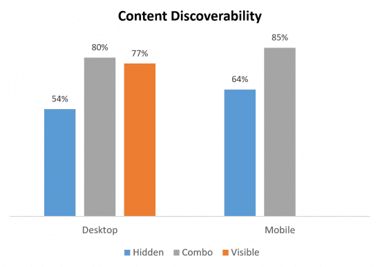
Hidden navigation menus, such as hamburger menus negatively affect discoverability, increase task time and perceived difficulty of the tasks.
Quantitative user testing studies aren’t as common as qualitative studies in the world of User Experience Research, but this brilliant study by Nielsen Norman Group (NNG) with 179 participants found that hidden menus, such as hamburger menus led to worse discoverability on both desktop and mobile devices.
Methodology
The study by NNG used remote unmoderated testing, which involves users recording their screen and voice at home, whilst working through instructions. Six live websites were tested across desktop and mobile, including three types of navigation:
- Hidden navigation: where the main navigation is placed under an icon (e.g. hamburger) and the user is required to click or hover over the icon to display the navigation
- Visible navigation: main navigation shown clearly in a navigation bar
- Combo navigation: a combination of both hidden and visible on the same site
Key findings
- Researchers found a 20% drop in discoverability on websites with a hidden navigation when compared with combo or visible. Visible or combo navigation led to more people completing the task successfully without having to use the search function on the sites.
- Hidden navigation led to significantly higher self-reported difficulty ratings, suggesting that hiding navigation makes it harder for users to complete the tasks they are trying to complete.
- Users were slower on sites with hidden navigation, 39% slower on desktop and 15% slower on mobile, compared to visible or combo navigation.
Key takeaways
Hidden navigation is not good for users, and if it takes longer, as well as being more difficult to carry out tasks on a website, this could harm conversions and revenue. You may wish to consider using visible of combo navigation on desktop and mobile instead of a hamburger menu; it might look neat but it means the user has to work harder and is therefore another barrier to conversion.
Convinced hamburger menus aren’t right for your site? You might want to try Pizza menus instead.
- Source: NNG
- Sample: 179 participants
- Recommended resources: User testing 101 and Smart Insights User Testing resources provide an overview on how to do user testing.
from Blog – Smart Insights http://www.smartinsights.com/digital-marketing-strategy/are-hamburger-menus-hidden-navigation-good-for-ux/
via Tumblr http://euro3plast-fr.tumblr.com/post/152600839899

No comments:
Post a Comment