Examples of Facebook ad creative using Facebook’s latest ad options
With over 1 billion active users, Facebook is the largest social media platform by a considerable margin, and offers a degree of ad targeting considerably ahead of other comparable social networks.
Facebook represents an immense opportunity for businesses to reach their desired audience, but in order to get the most out of advertising on the platform, brands can’t just set an ad budget and sit back to watch the results flood in - getting cut through is tough. The best Facebook ads combine a ruthless attention to detail to make sure every element is optimised with a high degree of creativity to engage viewers and get those clicks flooding in. In this post, I’ll show examples of different ad types which are all working well to draw in customers and achieve the results they were set up to deliver.
Facebook ad types
Facebook offers a wide variety of ad options so that they can be tailored to generate the specific results that the advertiser might want.
- Clicks to Website: Send people to your website.
- Website Conversions: Increase conversions on your website. You’ll need a conversion pixel for your website before you can create this ad.
- Page Post Engagement: Boost your posts.
- Page Likes: Promote your Page and get Page likes to connect with more of the people who matter to you.
- App Installs: Get installs of your app.
- App Engagement: Increase engagement in your app.
- Offer Claims: Create offers for people to redeem in your store.
- Local Awareness: Reach people near your business.
- Event Responses: Raise attendance at your event.
- Video Views: Create ads that get more people to view a video.
Sometimes it easier to pick apart adverts done badly than to find examples of perfection, but we thought it better to show what works than remind you what doesn’t. So here are our 11 examples of truly effective Facebook ads, one for each ad type.
1. Clicks to website
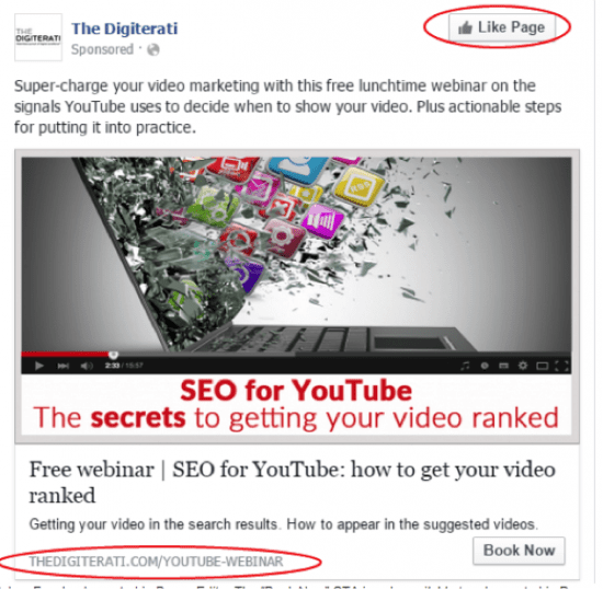
This is an example of an ad that has taken full advantage of the extra-features offered by power editor. The Book now button presents a relevant call to action, and the URL at the bottom has been edited in power editor to become a vanity URL that is again highly relevant for those who would see the ad. The image in this ad is attention grabbing, although I would not recommend a photo of a video player as Facebook ad guidelines are very tough on misleading content, which a photo of a video player could be construed as.
2. Website conversions
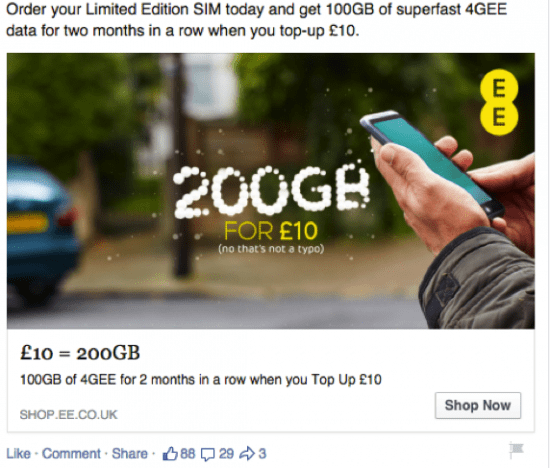
This objective is used when you want people to take specific actions on your website such as newsletter sign up or product purchase. Conversions are tracked using an embedded conversion pixel and you will be able to see the results in the reports section. In this instance it is driving people via the ‘shop now’ button to get users to order a limited edition SIM. The image is engaging and the humours element introduced via the ‘no that’s not a typo’ text further draws the reader in. Over all the ad does a decent job of making the particular offer seem extraordinarily good.
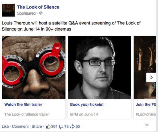
You also have the option of creating a carousel variant of the website conversion ad. This allows for multiple sub ads to different content all within one post.
This carousel ad is interesting because it includes the call to action in the sub-sections of the carousel to allow for multiple calls to action within a post without presenting a confusing and convoluted message. It also utilises images effectively, as they are high quality and relevant. However the text at the top of the post could be working harder to draw readers in.
3. Page post engagement
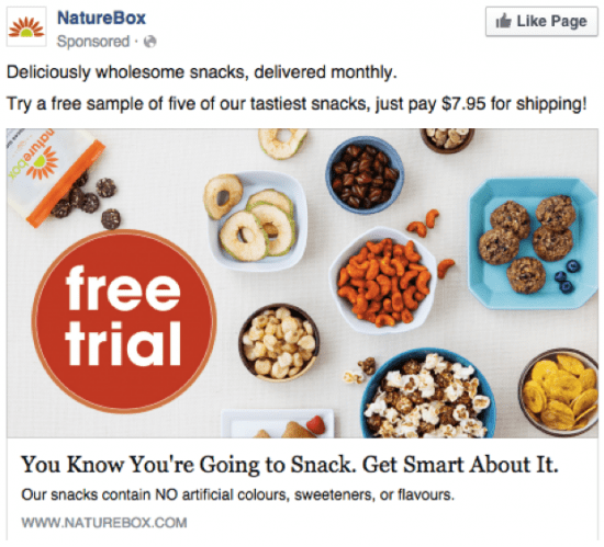
Page post engagement means you are ‘boosting’ a post to either reach more of your followers than it would organically, or to reach an audience you have defined when setting up the ad. This ad works well because it is visual (the image is high quality and relevant), and it also features a clear call to action. Rather than repeating its message, it firstly sums up its value proposition in 5 words, and then has a call to action. The image alerts readers to the fact a free trail is on offer, and the caption of the image intelligently appeals to readers’ common sense. Finally, the value of the product is reinforced below the image caption by informing readers there will be no artificial colours etc.
4. Page Likes
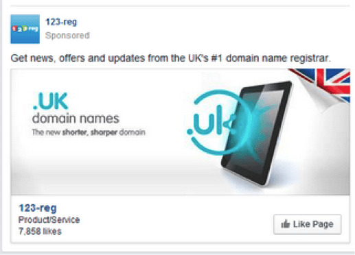
With Page Like ads it is generally best to keep it simple but make sure to get across a reason to like the page. Offer value to the reader, they won’t like you just because you asked them to. This ad does just this, offering news, offers and updates, whilst showcasing their value as being number 1 in their field. In this ad the image is sleek but could probably be doing more to get the readers attention.
5. & 6.- App Installs & App engagement
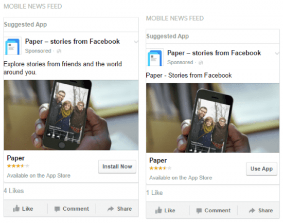
The app installs ad lets people install your app right form a call to action button within the post. An app engagement campaign appears the same as the app installs ad, but the call to action button reads as use app rather than install now and will open the app for the user.
This example works well because they have displayed their good user rating which gives a degree of social proof (This rating isn’t displayed in all app install/engagement ads). The text is very brief yet serves to simultaneously be a call to action and explains what the app does in one. Because the objective of the campaign is app installs/usage on mobile devices, these ads will only appear to people using mobile devices, which means images must be clear and not feature small text, which could be obscured when viewing on a mobile. The profile picture of the page posting the ad also appears quite small because it has to fit onto the screen of a mobile device. Therefore if you are running an app install campaign it may be worth changing the profile picture of your page to something very simple that can seen easily when viewed as a small thumbnail.
7. Offer claims
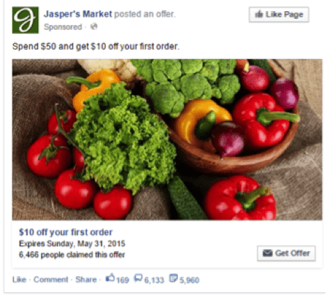
The offer claims ad allows you to construct an ad that means users to get an offer directly from the ad, rather than mentioning an offer and referring them to the site via a link and risk them falling out of the funnel down the line. In this example taken from Facebook’s own ad creation guide, the image uses vibrant colours to get viewers attention, and the offer is presented very clearly and succinctly. The author has successfully resisted the temptation to write all about the company in the text section of the ad, and has just stuck to the offer, which is exactly what a prospective customer would want.
8. Local Awareness
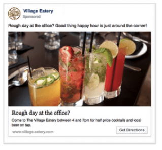
This is a great objective for local businesses - the Call to Action even includes “Get Directions” just like with Trip Advisor. However, this objective is currently only available in some countries.
This ad is using the local awareness offering brilliantly. The colourful image is clean and attention grabbing, and the question speaks to the reader effectively. Even if you had a great day at the office, it’s still tempting to press that get directions button. The sign off in the text that ‘happy hour is just around the corner’ is also clever, because the post would only be going to people nearby, and thus theoretically the business itself would also be ‘just around the corner’.
9. Event responses
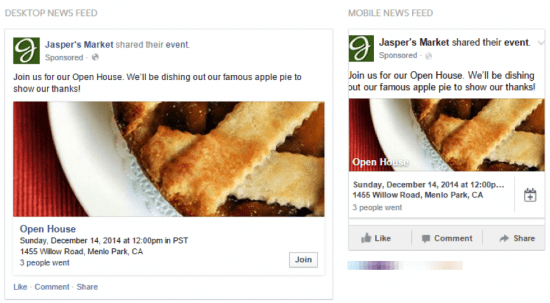
Turning again to Facebook’s own ideal examples of event ads, this simple ad showcase how to use the event response ad type effectively. Opening with ‘Join us’ reinforces the fact it is a real-life event, and the post successfully attains a homely feel, with the picture of traditional apple pie and by using language such as ‘dishing out’ which has informal and friendly connotations.
10. Video views
Facebook has really pushed video within the last few months and video posts enjoy the highest organic reach. With a vid ad you can get engage new audiences, possibly more effectively than other post types, so long as the video itself is high quality and engaging.
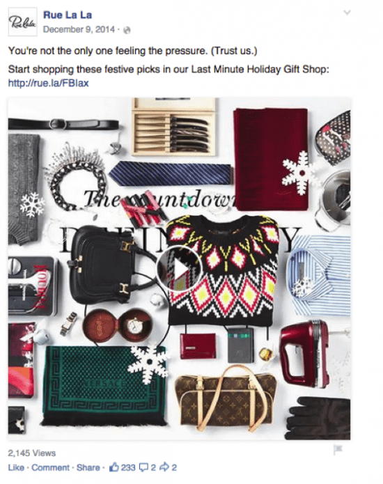
This video ad is particularly good as it has made great use of the full sized video thumbnail to showcase its offering, whilst also featuring a call to action in the text and engaging the reader by speaking directly to them. This helps to draw in the passing viewer so that they will stay to watch through the video.
Conclusion
When researching piece I noticed a glut of articles picking apart badly put together ads, and a dearth of content which showed examples of Facebook ads done right. None of the examples in this article were perfect, I’ve pointed out ways many of them could be improved, and I’m sure there are many more things that could have been further optimised. However as Facebook is a powerful marketing tool its important to show what a good ad looks like so marketers can generate ideas for their own campaigns. I hope this article has given you some ideas for your own Facebook marketing campaigns. If you want expert advice from industry experts in a detailed guide then our Facebook ads guide is perfect for you. Guides are available to expert members only.
from Blog – Smart Insights http://www.smartinsights.com/social-media-marketing/facebook-marketing/11-examples-of-effective-facebook-ads/
via Tumblr http://euro3plast-fr.tumblr.com/post/151611218204

i read a lot of stuff and i found that the way of writing to clearifing that exactly want to say was very good so i am impressed and ilike to come again in future..
ReplyDeleteperformance marketing fuer autohaus