Psychology has a bigger effect on purchase decisions than you think
A while ago I was doing my monthly “Let’s see what TED’s been up to recently” session, and I came across an older one: Dan Ariely’s Ted talk on irrational purchase behavior.
It’s well-worth a watch (after, of course, you finish this article).
In it, he breaks down the delusion that our buying decisions are rationally made. He discusses the true influences and psychological factors which affect our subconscious - the real determinants for why we buy that pack of gum, why that T-shirt stands out, or why we decide we need a jacket we don’t.
Ever gone into a store for a single thing and walked out with a full cart?
Psychology has a bigger influence on your prospective customers than you might think. Understanding how you can use psychology to influence buying decisions will make you a better marketer and improve sales.
This article will break down just a few of the most impactful psychological hacks your business can use to boost ecommerce purchases as well as give you actionable strategies for implementation.
Scarcity
The most influential psychological hack useful in the ecommerce world is scarcity. This is the umbrella term we use for both urgency and rarity.
- Urgency is “Sale ends Friday.”
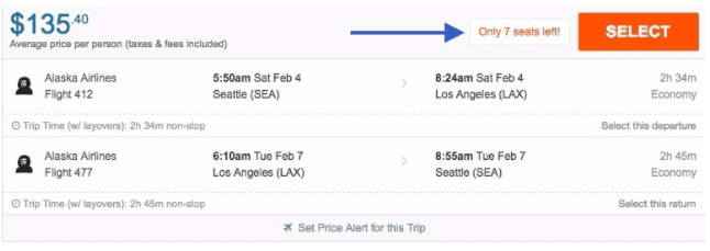
- Rarity is “Only 2 left!”
The reason that I’m discussing scarcity first is that it really is the most influential. A popular example of this is from a few years ago, where optimizer Marcus Taylor tested the addition of a countdown timer and the word “Now” to his page’s call to action. The test resulted in a 147% conversion rate increase. (Source: ConversionXL)
A couple of examples:
How to use this psychology hack on your ecommerce site:
- On your product page: Very simply, add the word “now” to your product CTAs. Alternatively, be sure all your promotions have a clearly stated (and near) end date.
- In a follow-up email: Trigger an automated email sent to contacts who viewed a product but didn’t buy. Prompt them to finish their purchase with a limited-time promotion or “limited availability” pitch.
Paradox of Choice
When I dove into the psychology of ecommerce conversion last year, the paradox of choice stuck out like a sore thumb. It was in every article - the most notorious element which determines (in this case) our not buying.
Rather than recite, verbatim, the initial concept (which is from about 17 years ago), I contacted the author of “The Paradox of Choice,” Barry Schwartz, to ask him to define it:
“I have little doubt that some people, some of the time, will be so overwhelmed with options that they become paralyzed, or if they manage to overcome paralysis and choose, they will be less satisfied with their choice than they should be and that they would have been if they had chosen from fewer options. Scientific progress is often about finding the limits to discoveries, and we don’t know the limits of the ‘too-much-choice’ effect yet. But the fact that there ARE limits does not make the effect any less real or any less significant.” (Source: Wishpond Blog)
For ecommerce, this means that the large selection of products you’re so proud of might not actually be helping your bottom line.
People are simple. Very quickly we can be overwhelmed with stimuli (more on that in the next section). Any good ecommerce site designer needs to recognize that more isn’t always better.
How to use this psychology hack on your ecommerce site:
- In your product directory, ensure you’re only displaying three or so products on any given line. Allow visitors to filter by color. Enable “winnowing” as much as possible so as not to give an overwhelming display of options.
Information Overwhelm and Progressive Disclosure
Let’s keep going with this idea of “people are simple.”
It’s true. Our brains, over the course of the past 50 years, have had to suddenly (evolutionarily speaking) absorb about a million times as much information in any given day as we did for the first several million years of us living on this planet.
So it’s no wonder that, from time to time, those brains get tired. And that leads to information overwhelm.
Information overwhelm is the concept that there’s an upper limit to the amount of information we can take in at any given time.
A 2010 LexisNexis survey of 1,700 white collar workers revealed that on average employees spend more than half their workdays receiving and managing information rather than using it to do their jobs; half of the surveyed workers also confessed that they were reaching a breaking point after which they would not be able to accommodate the deluge of data. (Source: ScientificAmerican)
Ever opened a textbook or started in on a complicated task at work and had to immediately close it? Ever been intimidated by a billboard advertisement or turned off a song because there was just too much going on?
If you throw too much at us, our brains will start ignoring things.
The answer, for ecommerce site designers, is progressive disclosure.
It’s a design idea where you give information to your site visitors slowly and in bite-sized pieces. And then you leave the option to “learn more” in their hands.
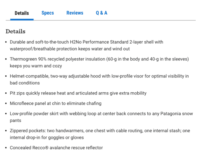
REI could, technically, put all the “Details,” “Specs,” “Reviews and "Q&A” in a long section of the product page. The display above, though, is more manageable. This ensures you don’t overwhelm your visitors (especially with more complex products) as soon as you arrive on the page.
How to use this psychology hack on your ecommerce site:
- Use tabs to give information about products, rather than displaying it all immediately.
- Add a “Learn more” section to product pages, rather than displaying all information as soon as people arrive.
- Use expand chevrons or arrows to open sections of a page which start hidden.
Price Perception
Price perception suggests that “consumption is driven not so much by the actual cost of a paid-for product as by its perceived cost.” (Source: HBR)
Do you carry cash? If you do, how affected are you to see it disappear? Do you think you’re more affected (emotionally) than you are by that same dollar value disappearing from your debit card account?
I mean, you never even saw that money. You were paid, and then some of it went out again. It’s almost fake.
Essentially what I’m saying is this: the prices of your ecommerce products aren’t entirely separate from the world around them. They’re contextual, and they can be manipulated (without changing the actual value).
How to use this psychology hack on your ecommerce site:
- At all costs, avoid surprising your site visitors with unexpected costs. If they’ve reconciled themselves to paying 29.99 for this product, don’t spring an extra $4.99 for shipping.
- Even if they would have been comfortable with the product being $35 in the first place, the “added fees” will ruin conversion rates nonetheless.
- A product’s price is less intimidating if you break payment into more appealing price points (“4 easy payments of $24.99”).
- $100 is, subjectively, more than $5 more than $95.
- “Payments that occur at or near the time of consumption increase attention to a product’s cost, boosting the likelihood of its consumption.”
- “Payments made either long before or after the actual purchase reduce attention to a "product’s cost and decrease the likelihood that it will be used.”(Source: HBR)
Conclusion
The human brain is one of the most complex things in the universe, so it’s often a surprise to learn that it can be influenced by something like a countdown timer or overwhelmed by a block of text on a page.
And yet, time and again ecommerce marketers improve conversion rates by adding psychological factors and hacks to their sites.
What do you think? Do you think you’ve ever fallen into a psychological trap when making a purchase decision?
from Blog – Smart Insights http://www.smartinsights.com/marketplace-analysis/consumer-buying-behaviour/human-psychology-hacks-boost-ecommerce-purchases/
via Tumblr http://euro3plast-fr.tumblr.com/post/157523843969


 Thanks to
No comments:
Post a Comment