Neuroscience reveals how you can nudge your customers into converting
Dr. David Lewis, neuroscientist and author of The Brain Sell, delivered a fascinating keynote speech about customers’ brains when they buy at Ecommerce Conversion World 2017 in March. Here are 3 fascinating insights about your customers and suggestions on how to apply them to your website to increase conversion rates.
Fact 1: People Notice What’s Different (or the Same!)
While this may sound contradictory, Dr. Lewis suggests that there are actually 4 factors that make a person stand out in a crowd.
- There’s something inherently different about the person, such as exceptional beauty or a striking feature
- The person has made themselves look different, such as with tattoos or colored hair
- The person looks familiar to you, like someone you know in real-life or from a film
- It’s someone you’re specifically looking for
Use it On Your Site
People don’t buy from websites; they buy from other people. More than that, they buy from people they like. It’s important to show the people behind a product or site, especially if you don’t have a strong brand behind you. Give your ‘About Us’ page some love.
Similarly, if you want a product to stand out, you’ve got to make it unusual, or similar to a product your visitors know (and love).
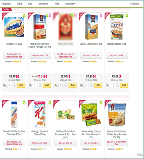
You could try grouping products on a listing page so that a product you want to draw attention to is among a group of different items, such as a red coloured cereal packet among lighter coloured packaging. The image above is from an implicit association test and the blurred product here was the standout item on the page.
Fact 2: Pictures have Power
You’ve probably heard the old saying that ‘a picture is worth a thousand words’, and it couldn’t be truer on your website. Images do more than capture the reader’s attention, break up a long body of text, and supplement important information on a page. Our research consistently shows that the vast majority of e-commerce browsers will only look at product images and never even read the copy. Here are a few other ideas that may be new to you:
- Articles with at least one image per 100 words are twice as likely to be shared on social media - so get counting and sharing!
- Instructions with images are 3x more likely to be followed correctly
- People are prepared to pay more for products and services with good design
Use it on Your Site
Invest in your product photography. Don’t underestimate the value of this. So important is it for Amazon that they patented their product photography setup. Every day we see how the buying decision is made or lost, based on images. It’s often a substitute for the lack of touch and feel that comes with buying online. Here are some suggestions for your product detail page:
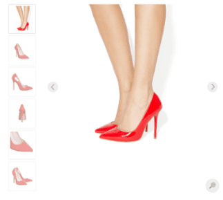
Always have more than one product image. Not just for the sake of it, but to bring the customer closer to a decision. Show different angles, perspective, dimension and in situ. For example, shoe buyers often ask to see the sole as well as the inside of the shoe. The higher the price, the more important this is.
Customers may have questions about products that need to be answered before the purchase decision can be made. Not only do they look for those answers in product images, but they assign more value to them than what is written in the copy - if they even read the copy.
For example, if the image contains batteries and the description specifically says “batteries not included”, the user may be inclined to believe that batteries are included as shown in the image. Know the questions your customers have, and try to answer them with photographs.
In a virtual environment, customers only have images on which to assess quality. Help them do that by showing close-up views of joints, seams, button holes or any relevant detail.
If you use the same photographs supplied by the manufacturer that your competitors use, see this as an opportunity to stand out from the crowd. Have your own photographs taken that are helpful in making the buying decision.
Fact 3: People are More Likely to Prefer Puma Trainers after Seeing Pictures of Dogs.
Ok, bear with us on this one - no matter how unlikely it sounds, it does make sense.
In an experiment testing the influence of environmental cues on product evaluation and choice, participants identified Puma trainers more quickly if they had been shown photos of dogs. The reason for this is the conceptual link: dog - cat - Puma.
In fact, the more dogs they had seen, the more quickly they identified the Puma trainers. Not only that, but participants also identified the trainers more positively, the more dogs they had seen.
FYI, this also works for priming people to think of a certain chocolate!
In a similar study, researchers asked participants to list types of chocolate and found that people were more likely to name Reese’s when they had been exposed to the colour orange (on the lead up to Halloween, when pumpkins, or orange environmental cues, were on every corner). One week later, when the orange cues had gone, 20% fewer people bought Reese’s to mind when asked the same question.
Use it on Your Site
Not a shoe retailer? The logic still applies - prime your website visitors to imagine the favourable outcome of using certain products by using associated imagery.
For example, a wine retailer could display an image of friends socialising and having a great time. It worked for our client. Those mountain bike images taken in perfect studio conditions are great, but the mental conclusion you may want your customer to reach is having fun in the mud. Take that bike and get out of the office. Oh, and remember to take photographs.
As with any hypothesis, we suggest A/B testing the changes to measure their impact.
from Blog – Smart Insights http://www.smartinsights.com/marketplace-analysis/consumer-buying-behaviour/3-facts-you-didnt-know-about-your-customers-according-to-a-neuroscientist/
via Tumblr http://euro3plast-fr.tumblr.com/post/163205978474


 Thanks to
No comments:
Post a Comment