Learn the best practices for landing page optimization to help generate quality leads for SaaS
Landing pages are the heart of any inbound marketing campaign, mainly because they have the unique ability to convert complete strangers into qualified leads. Surprisingly, 44% of B2B companies direct visitors to their website’s homepage rather than to a specific landing page.
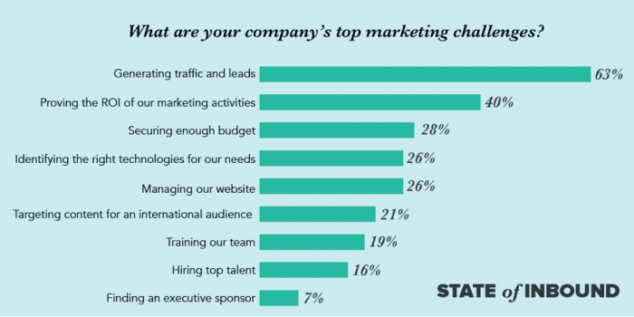
Perhaps this can explain why according to the latest State of Inbound 2017 report, the majority of marketers still struggle with generating new leads for their businesses.
Building a well-designed and optimized landing page is one viable way to help your SaaS business overcome this marketing challenge.
What is a landing page?
A landing page is a specially designed page where you direct your visitors to collect their information in exchange for an offer like an ebook, free trial, online course, or even ROI calculators. It is one of the pillar components of inbound marketing because this is where you can generate new leads for your business.
Landing page optimization tips
No matter how beautiful your landing page may be, if it is not optimized correctly, you will not fully benefit from its lead generation capability for your SaaS business.
Here are ten simple landing age optimization tips you can do on your site’s landing pages to increase your lead generation ratio.
If you want more tips and examples of perfect landing pages, check out Dave Chaffey’s perfect landing page examples.
1. Understand your customer
Inbound marketing focuses on your customer. So it follows that you need to make sure that the layout design, content, and offer on your landing page is something that your customer will find educational, engaging, and helpful. Some ways that you can do this include:
- Developing a clear buyer persona.
- Using surveys and feedback forms.
- Studying your competitors’ landing pages.
2. Have a compelling headline
According to Kissmetrics, you only have 8 seconds to make a lasting impression, and convince a visitor to enter their information in your lead capture form.
Some ways to craft your headline so that it catches your visitor’s attention in time:
- Answer the question, “What will visitors who convert receive?”
- Highlight the most significant benefit your visitor will get.
- Perform the Blink Test on your heading
3. KISS your copy
KISS stands for “Keep It Short and Simple.” Make sure your visitors can skim and scan the copy of your landing page. Some ways to do that are:
- Highlight key takeaways with bullet points.
- Add white space.
- Use short, simple words.
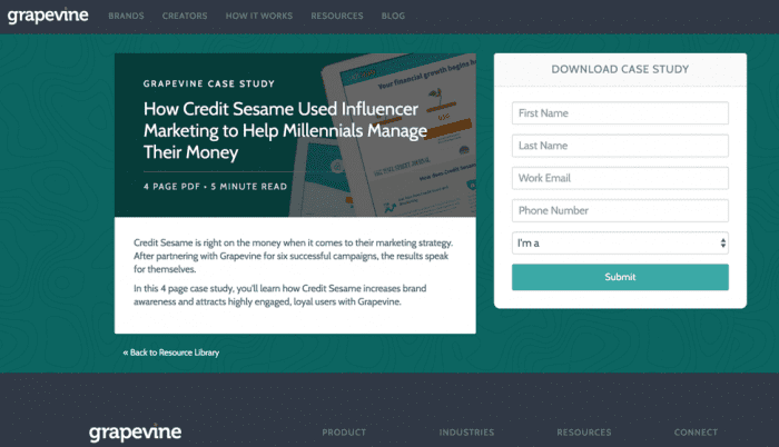
GrapeVine Logic’s landing page offering a whitepaper is an excellent example of this:
4. Make your landing page SEO-friendly
While Google and other search engines are now giving more preference to quality, SEO still plays a huge role regarding page ranking. If you want your target audience to find your landing page, you need to apply some SEO best practices:
- Research long-tail keywords to use for your landing page.
- Make sure to include your keyword in your landing page’s title, headers, URL path, and content.
- Include alt tags for your images.
- Google and search engines love pages that are shared a lot, so don’t forget to add social share buttons.
5. Stay ‘above-the-fold’
Above-the-fold is a term first used back in the day to refer to content found on the top half of newspapers. Today, this term is used to refer to content that is located above the bottom of your browser window as soon as the page loads.
People do not scroll down a page unless you give them a good reason. That is why it is essential to put all of the valuable information above the fold, specifically:
- Landing page copy
- Lead capture form
- Call-to-Action button
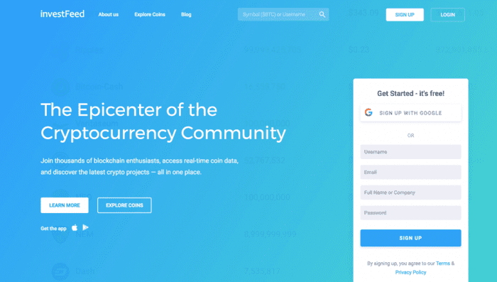
Invest Feed does a great job in keeping all the essential details of the landing page above the fold as we can see below:
6. Ask the right questions in your lead capture form
Keep in mind that your visitors are very protective when it comes to giving out their personal information, especially if they are first-time visitors. You can ease the apprehension by:
- Evaluate the value of your offer. The more valuable it is, the more information you can ask.
- Ask your sales team to find out what information they need to guide your leads through the funnel.
- Avoid asking for sensitive information.
- Include a link to your privacy policy to put them at ease.
7. Create a compelling offer
Your lead capture form may be the most critical part of your landing page when it comes to generating new leads. However, if you are not offering something that will catch your audience’s attention, it will not do you any good.
Before you create the offer for your landing page, ask the following questions:
- What problem do you want to solve?
- What stage of the buyer’s journey is this for?
- How will this benefit my target audience?
- What format should be used for the offer? (e.g., Ebook, webinar, audio recording, email course)
8. Tapping into the Power of One
An optimized landing page is laser focused. It contains only one offer, one headline, one solid message, and one call-to-action. Giving your visitors options will just distract and confuse your visitors, and there’s a very good chance that your visitor will end up not choosing either one.
9. Test your landing page
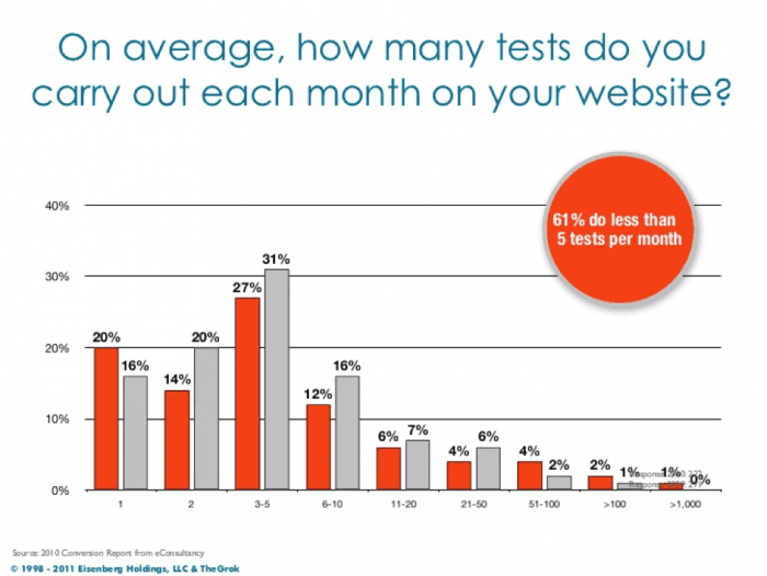
Believe it or not, 61% of companies run less than five tests on their websites each month
Even though you are using a landing page layout and design that worked well for you in the past, that does not mean that you will get the same results the second time around. The fact is that there is no “one-size-fits-all” when it comes to inbound marketing because buying behaviours change.
Running an A/B test (otherwise known as a Split Test) on your landing page is, by far, the best way help you optimize your landing page so that it generates the highest number of leads possible. Among the things you need to test are:
- Layout design
- Landing page color scheme
- Headline
- Lead capture form
- Size, color, and text of your CTA button
When doing a Split Test, make sure that you only change one variable each time you run the test. Doing this will help you come up with a landing page design that’s eye-catching, aesthetically-pleasing, and above all, converting.
10. Don’t forget the ‘Thank You’ Page
As its name suggests, a ‘Thank You’ page is where you thank your new leads for giving you their information. At the same time, it gives them the next steps to get the offer that you promised.
Some things to remember when creating your ‘Thank You’ page:
- Provide specific details how your new leads can get the offer you promised.
- Add social sharing links and buttons.
- Invite your new leads to follow you in social media by adding social follow links.
Landing page optimization is just one of the many lead generation strategies you can use for your SaaS business. Apply any one or all of these tips will help you get more qualified leads that you can now hand over to your sales team to slowly convert into customers.
from Blog – Smart Insights http://www.smartinsights.com/conversion-optimisation/landing-page-optimisation/10-landing-page-optimization-tips-saas-generate-leads/
via Tumblr http://euro3plast-fr.tumblr.com/post/166808673954


No comments:
Post a Comment