What’s the secret to successful visual content marketing for finance brands? Find out with our 8 foolproof tips.
The finance world can be a tough place for a marketer. Creating inspired content that communicates brand messages, engages customers and keeps the compliance team happy is a tough nut to crack.
But fear not - there is a way to tick each of those boxes, and it’s all about taking a visual-led approach.
At Infogr8, we’ve found that telling visual stories delivers particularly brilliant results for finance brands. Combining the crucial strategic vision with user-friendly design opens up big possibilities for creative, shareable and high-impact finance content.
Want to know how you can achieve this too? Take a look at our eight best-practice guiding principles when creating any kind of visual content for a finance brand.
1. Directly answer customers’ financial questions
Using search insight and research data to find out which finance topics customers are struggling to understand is arguably the most powerful starting point when planning visual content.
Breaking down detailed financial information in a creative way means you can directly answer these queries in truly consumer-friendly ways – which is great for users and search engines alike.
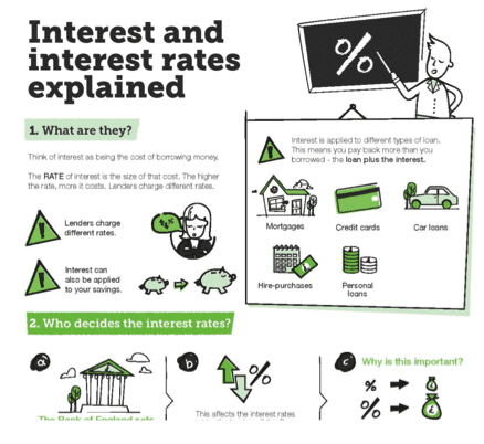
Example: Interest Rates Explained infographic
Research carried out by the Money Advice Service (MAS) revealed that 75% of homeowners hadn’t considered how an interest rate rise would affect their mortgage repayments. We worked with the MAS team to create a question-based infographic that worked to fill a wide range of customer knowledge gaps to create a static infographic, which was also used by RBS.
2. Make complex financial information accessible
There’s no way around it – quite often, financial data or messaging can sometimes be mind-meltingly complex.
The big opportunity with visual content is to present a distillation of the technical, complicated or, dare we say it, sometimes boring in a way that’s instantly accessible. The best finance content pairs clean, bright design with a clear editorial flow, visually guiding the user through the key points quickly and accurately.
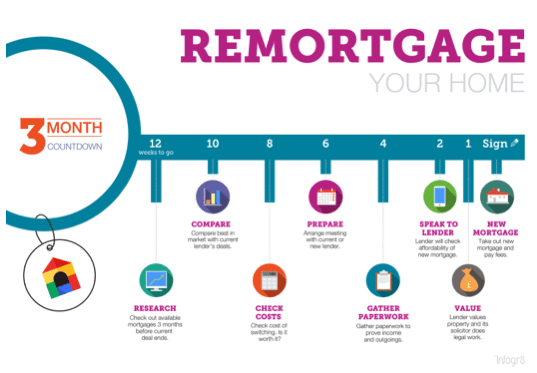
Example: Remortgage Your Home infographic
With remortgages on the rise, the need for clear information about the processes involved is greater than ever. This linear left-to-right infographic for Google and the MAS succinctly presents the main steps to the complex process of remortgaging in a way that is intuitive and easy to digest.
3. Be interactive
According to the Content Marketing Institute, educating an audience is the number one reason why brands create interactive content. This highlights how effective it can be as a format for finance companies, whose remit is often more about communicating information rather than entertaining or inspiring.
We’ve found that interactive visual content and tools can deliver impressive results in terms of engagement; by its nature, the format draws the user into a branded online space in a personal way. For finance brands, this is an invaluable opportunity to positively connect and offer value to the customer, as well as an effective way to improve sentiment.
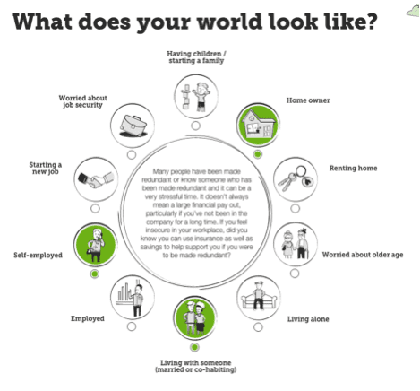
Example: Protecting Your World interactive microsite
This interactive visual tool helps people understand what insurance they need depending on their lifestyle and circumstances. After working through a series of scenarios, they’re then offered highly tailored advice on the policies that best suit them.
4. Plan to use assets across multiple channels
The key word here is ‘plan’ – ensuring from the very start that finance content is created in a way that makes it easy to atomise and repurpose will (pun alert) pay dividends when it comes to distributing your message to users at different knowledge levels.
A long form explainer piece about ISAs might be ideal for your website, for example, but don’t forget about creating a cut-down version that’s ready and waiting to post on social channels a week before the ISA deadline.
Plus, approving a suite of content along a theme – rather than creating it all individually – can make legal and compliance signoff go much more smoothly.
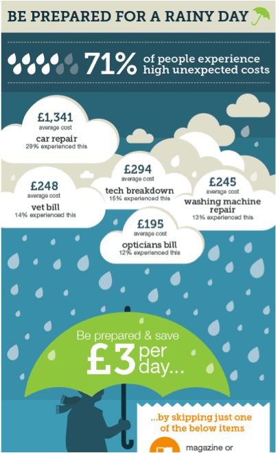
Example: Save £3 a Day multi-format visual content
Since 71% of people experience high unexpected costs at some point in their lives, this content was designed to help people save £3 a day for a rainy day fund. We contributed to a suite of aligned visual content for web, social, outdoor and print PR, centred on a practical, data-led infographic.
5. Tell short finance stories that are quick to digest
Let’s face it – many of us struggle to fully understand the more detailed side of finance, and that can make the whole topic seem overwhelming. But, whether about personal finance or the bigger picture, ‘short stories’ are a great tactic for delivering intimidating-seeming data in a bitesize snapshot.
We regularly use data cards to visualise key finance stats and figures – ultimately, to turn them into a story. These cards can be easily understood in seconds, and leave a high impact, especially on social channels – after all, people remember 65% of information in text and images three days later, compared to only 10% of information in text.
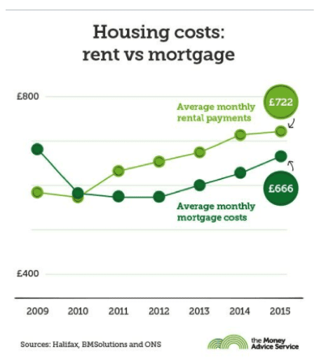
Example: Housing Data Stories
This series of data cards were developed for use across social channels. With UK housing costs continuing to rocket, especially in London, these cards visualise the latest data and trends in an easily consumable way that is particularly suitable for mobile users.
6. Use print in creative ways
Eleven million people across the UK don’t have the online skills to take advantage of shopping, banking or comparison sites – something that presents a serious challenge to financial brands in our increasingly digital world.
To achieve impact in the physical world and reach less digitally-savvy customers, printed content offers a solution. But that doesn’t mean it has to be dull finance information presented in endless pages of text. Using original print formats that are attractive to look at – and even interact with – can really achieve cut-through.
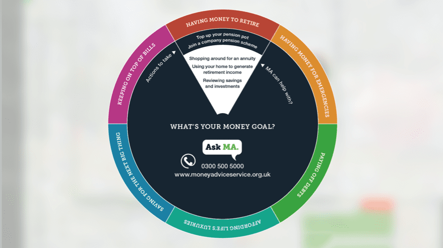
Example: What’s your Money Goal? physical (printed) interactive content
Research by Asda, the Tinder Foundation and MAS showed that some of the UK’s least digitally confident consumers live in the North East. They asked us to create an interactive printed wheel that Asda shoppers could use in-store to help them plan their money goal.
7. Create topical content with PR potential
To drive up sentiment and brand trust, positive PR is an essential part of the mix for most financial brands, who often battle negative media on a daily basis. Topical visual content can be one of the most likely formats to be picked up by publishers, and can go a long way to boosting the volume of positive coverage.
Using exclusive proprietary figures or research about the financial hot topic within the content will make it even more compelling for publishers to reference, especially if it’s integrated with a PR campaign.
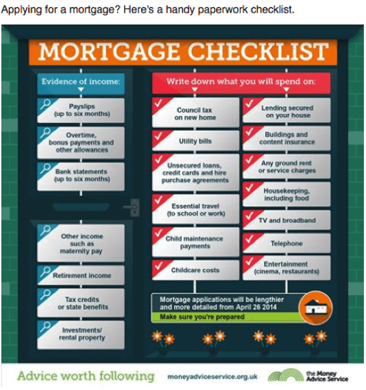
Example: Mortgage Checklist micro content
In April 2014, the Financial Conduct Authority (FCA) introduced tougher affordability checks on mortgage lenders. Working with the MAS PR team, we created a micro checklist explaining the new mortgage paperwork requirements.
The piece was featured on Rightmove and This Is Money, where it earned 137 comments, as well as the government’s ‘Housing Matters’ magazine. Facebook and Twitter versions of the graphic got 65,000 and 174,000 clicks respectively.
8. Establish clear visual guidelines
Last but by no means least, it’s essential to work to visual content guidelines. This applies to all sectors, but especially for finance companies, where brand control and consistency is crucial in maintaining customer trust.
Having a set of visual guidelines is also helpful for internal brand teams and agencies alike, making the content creation process simpler, faster and more likely to comply with brand and legal standards. Plus, it ensures that all of your content hangs together effectively, wherever it’s published.
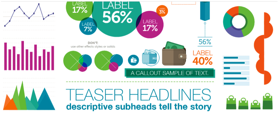
Example: Money Advice Service infographic guidelines
Infogr8 established a set of visual guidelines for designers to follow when developing infographics and data visualisations for MAS.
It includes advice on typography, responsive grids, hybrid content and the style and labeling of data. All these ensure designers have the flexibility to visualise information on a wide range of topics, while keeping the same look and feel.
from Blog – Smart Insights http://www.smartinsights.com/content-management/content-marketing-creative-and-formats/create-awesome-visual-content-finance-sector/
via Tumblr http://euro3plast-fr.tumblr.com/post/159144724074
 Thanks to Richard Silvester for sharing his advice and opinions in this post. Richard Silvester is one of the emerging leaders behind the visual content movement having founded infogr8 one of UK’s most successful data led content agencies in London. You can follow his tweets
No comments:
Post a Comment