How to boost your social media marketing with the power of visual storytelling
On social media, cutting through the noise is no easy task. But it’s the question you have to ask yourself with every piece of content you aim at your customers — how do we make our story rise above the cacophony?
As Picfair’s community and content manager, working with publishers and content creators across the globe daily, a constant theme in my work has been ensuring images are used to maximise the potency of any social media content. Here are some actionable steps to improve your visual storytelling on social media.
1. Be Human
The need for stories that strike an emotional chord has never been more important. Joe Pulizzi, CEO of Content Marketing Institute recently wrote: “In past years, a term that was frequently mentioned at Content Marketing World was “relevance.” Six years later, that sentiment has evolved into a more specific term: “resonance.” Telling relevant stories is a must, but telling ones that resonate makes all the difference. Ask yourselves this: Is your audience simply viewing your content? Or does it make them feel something? Even more, does it make them want to do something?
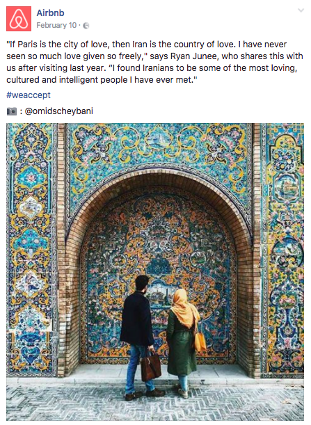
Take Airbnb’s values-driven approach and their mission to put people first. Their #WeAccept campaign promotes a message of diversity and acceptance, an extremely relevant issue in the current political climate. But what really resonates is their passion for documenting real-life stories. All visuals supporting the campaign on social media are of real people, painting an authentic picture of everyday acceptance. By sharing these human experiences, they are emotionally encouraging their followers to open up their homes and to donate to organisations that assist those in need. Airbnb wants you to feel something, and to be moved enough to take action.
2. Don’t treat images as a secondary to words
The average person gets distracted in 8 seconds, though a mere 2.8 seconds is enough to distract some people. In the social media era, images alone have the power to make a bigger initial impact than copy, so treat visuals just as importantly when communicating your brand story.
Patagonia is a leading example of a brand adopting visual storytelling into their marketing strategy, using it to drive a loyal fan base and a strong presence on social media. From powerful visuals that help to reinforce their environmental stewardship to stunning adventure shots that speak directly to their core audience — Patagonia is constantly thinking of dynamic ways to capitalise on the power of visual communication in the digital age. Skimming over the brand’s imagery on their social channels, you get you a discernible sense of who they are and what they want people to feel — vital when you might only have as little as 2.8 seconds to make a first impression. Set this as a challenge for yourself when choosing imagery, is the photo working hard to communicate a sense of the story without your audience having to read any copy?
3. Create bespoke visuals for each channel
The most successful companies capitalise on the diversity of social media platforms by customising content for each channel. Every channel has a different audience and different users. That said, it’s not easy keeping up with the ever-growing variety of platforms and features being churned out daily. To conquer this, create a list of visual guidelines for each. Even better, create branded templates that you can repurpose − having a consistent visual style will make it easier for audiences to recognise your content on their feeds.
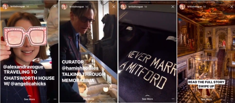
British Vogue has developed a ‘visual vocabulary’ for different types of content featured in their Instagram stories. While the content is sourced from various members of their digital team, it’s always fed back to the digital picture editor who ensures the composition is consistent. Their approach is working and they’ve built an audience of 1 million followers on Instagram in just one year. Make sure to also keep on top of the latest image sizes for each channel − Sprout social’s ‘Always Up-to-Date Guide To Social Media Images’ is an essential resource for Picfair’s content team.
4. Test your visuals
A golden rule that is often neglected: test, test and test some more. It’s not enough to assume which images might go down well with your audience — you’d be surprised at how often a burning intuition, can, in fact, be disputed by audiences. Yes, there are general indicators of what imagery tends to do well, but these aren’t set in stone, and you can’t predict how people are feeling at the specific moment your content lands in front of them. Test different visuals for your approaches and tweak them accordingly based on your engagement data. Social sharing giants Buzzfeed aren’t dominating their field by luck, their content strategy is built on relentless measurement. They conduct thorough testing of their content and regularly have their data science team meet with editorial teams, together going through the insights.
It’s important to also compare how embedding full images on certain channels performs against image previews, where your small thumbnail is accompanied by the clickable box linking out to the piece. Inbound marketing leaders, HubSpot, utilise the image preview option for many of their sponsored ads on LinkedIn. Given that they serve various thought leadership and how-to content to marketing professionals, this format is beneficial in terms of providing a click through to the blog, and for customising the link’s headline and description. While some argue that image previews are not as visually pleasing as embedding full images, Hubspot would argue there is value in this format and continually drive high quality leads with their ads. So, don’t jump to conclusions — test to find out what works for your brand.
5. Use long-form captions
While Twitter imposes a 140-character limit, Instagram users revel in the ability to tell their stories more freely. Instagram limits caption length to 2200 characters; a perfect blank page waiting for a well-crafted story. Leading publishers like National Geographic and General Electric are mastering this tactic daily. The golden rule is to start with a strong opener; captions are cut off in the main feed after 140 characters, with users needing to click to ‘more’, so leave your secondary hashtags to the end. One of Picfair’s most highly engaged Instagram posts came from one of our photographer takeovers — a stunning photo accompanied by an equally absorbing first-person account to complete the story.
In summary
Take the time to work on your visual storytelling in the same way you would treat any other element of your social media strategy. It shouldn’t be an isolated piece or a last minute ‘we need a photo for this blog’ afterthought. Do what’s necessary to make it work — 21st century audiences simply won’t tolerate lazy content creation from brands, they expect more. Try to engage the emotions of your audience; build template kits to post distinct content on each channel; tell longer stories when you can, and always keep testing.
from Blog – Smart Insights http://www.smartinsights.com/social-media-marketing/social-media-strategy/5-tips-nail-visual-storytelling-social-media/
via Tumblr http://euro3plast-fr.tumblr.com/post/159483470939


 Gemma is Content & Community Manager at
No comments:
Post a Comment