Twitter introduce rounded profile photos, live engagement updates and much more.
You may have noticed last week Twitter updated its look and redesigned some of its key features. Most of the changes are mainly aesthetic but have been applied to make Twitter look consistent across both IOS and the Andriod app. Twitter announced the redesign last week quoting:
‘We’re refreshing our product too and making it feel lighter, faster, and easier to use. We listened closely and kept what you love. And for the things you didn’t, we took a new approach to fix and make better.’
What’s changed?
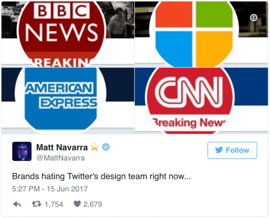
The most obvious feature that Twitter has changed is switching from square profile photos to rounded images. Although not everyone has taken too kindly to the new profile icons.
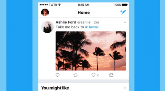
Additionally, the update has changed the look of interaction buttons on tweets, for example swapping the 'reply’ arrow for a speech bubble, as Twitter says some newcomers had previously confused the arrow for a backspace or delete button.
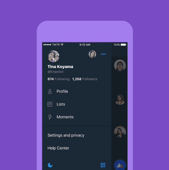
The bottom navigation now features fewer navigation tabs, instead of five, there are four. These four tabs are for home, search, notifications and direct messages. you can now access your profile in the navigation menu in the left-hand corner. This is your new control panel, you can access this by swiping left. This holds your profile, Lists, moments and settings.
One cool new feature they rolled out was your likes, retweets, and shares on each post can be counted in real time for mobile apps. So you can watch the response to your epic tweets as they happen.
Photos should also look different with new rounded edges to improve the layout of the app. When viewing an image in the Twitter photo-viewer, the background color is now based on the dominant color in the photo.
Lastly, the change to the iOS app is that links to articles and websites will now open in Safari’s viewer rather than in the Twitter web viewer. According to Twitter, this is so you can easily access accounts on websites you’re already signed into.
How does this affect you?
From a marketing point of view, the key element to check your current profile photo is compatible with the new layout. Test this on both desktop and mobile to ensure your happy with the new look. If you are active on Twitter make the most of the features by ensuring you fully understand how they work, look at how you can make them work for your business.
It is clear Twitter have listened to their user’s feedback and made changes according to this. Even though Twitter received some backlash from this update its good to see a social media platform adapting to their user’s needs. Hopefully, in the next update, we will finally have the much-requested edit button.
If you are looking to expand your social media strategy and grow your Twitter following check out our Social Media Marketing Toolkit. Packed with practical resources to help increase engagement and interaction.
from Blog – Smart Insights http://www.smartinsights.com/social-media-marketing/twitter-marketing/twitter-launches-redesign/
via Tumblr http://euro3plast-fr.tumblr.com/post/162078020134


No comments:
Post a Comment