Friday, 29 December 2017

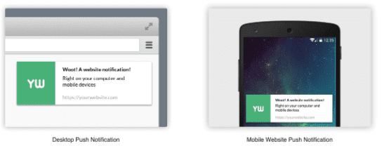
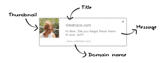
What are web push notifications?

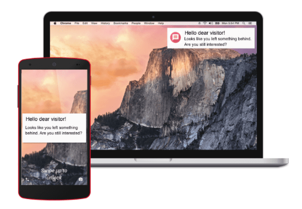
How you can use push notifications to increase your online conversions

You already know about email, social media, affiliate marketing, SMS, ads (Google Adwords, Facebook, Bing). All these channels have their own piece of the marketing promotion pie, where you can deploy different kind of campaigns to reach and engage users.

Online businesses use all or a part of these channels to attract visitors to their website, as well as engage with the ones who have already visited it. But there’s a new one that looks very promising for both businesses and users: push notifications.

Push notifications have a short history in the world, coming from mobile apps, where IOS and Android used them as the default way by which mobile apps communicate with their users.

The advantage of delivering the message in real time with a higher response rate compared to email (50% higher according to CampaignMonitor) gives this channel the chance of becoming number one in terms of marketing ROI.

We might be also tempted to think of push notifications and text message of being the same, but they have crucial differences.

  • Permissions for push gives user greater control over what kind of messages he/she wants to receive
  • SMS comes unsolicited and it’s sometimes impossible for the user to disable it
  • The costs of SMS are much higher, going about 5 cents per message, where push notifications are almost free

Are notifications going to replace email marketing?

Mobile marketing and marketing automation is where the magic is these days. Notices of sales, offers and discounts landed in customer inbox are not enough to build a good marketing strategy. Now, customers want those alerts in real time, flashed up on the screen of their mobile device, easy to discard or to take an interest in. These instant alerts, called “push notifications”, are being widely adopted by consumers and if your business is not using them, you are very likely losing money.

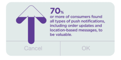
A survey by Responsys found from 1,200 adults that almost 60% of adults have downloaded apps from their favorite brands and from those, 7 in 10 have enabled push notifications.

Push notifications will not replace email marketing, the same way email marketing didn’t replace old catalogs received through emails, but will definitely get a piece of this pie.

What are the benefits of such notifications?

Real-time communication

Instant delivery of push notifications allow you to communicate in real time. Being flexible in marketing strategies and having an ability to react to breaking news and relevant trends in order to communicate with customers is strongly encouraged for a business.

Non intrusive

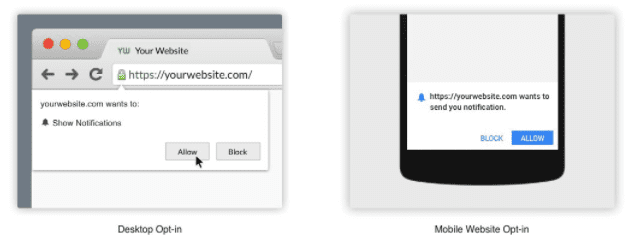
Every visitor has to decide himself whether he wants to receive notifications or not from you. This means that as a business owner you do not have to worry about bothering your clients with push messages, as visitors themselves agreed to receive them.

Fast implementation.

Website push notifications are easy and fast to implement. Service have all the necessary script writing done and the only thing you, as a client in this case, need to do is copy-paste ready Javascript into your web page. It usually takes just a few minutes and with an assistance of customer support can be done by anyone.

Read more about getting started with push notifications

How other online retailers are using push notifications?

Walmart

Walmart used push notifications to send consumers new products that the customers have shown interest in previously. This increases user retention rates by up to 100%.

Another advantage of having offline supermarkets everywhere, allowed the company to developed a geo-based push notification that lets the app to automatically send relevant pieces of information based on its current location.

Buy Whole Foods Online

Growing total customer number from 1150 to over 2000 in just 2 weeks was easy for this british small retailer using push notifications.

Image: courtesy of buywholefoodsonline.co.uk

How can you make use of push notifications to drive sales to your online store?

1. How often send a push notification

Push notifications are not so intrusive as emails, and people are already used to receive a few a day.

Try to see it from your customers’ point of view. Ask yourself whether this type of message is really suitable for notification.

We’d recommend sending one per day, or maybe two if your customers are active and are interested in your products.

2. Timing. What time to send?

According to experts from the Localytics, users read notifications on their daily commute to work, when in need of a distraction at work or when their smartphone is within reach. Notifications sent on working days have 66% higher rate of reading. During the weekend, the response on those push notifications is lower.

So, the optimal times are between 12 and 17 pm. That is the time when the user has the opportunity to read it.

TIP: Don’t send notifications too early in the morning or too late. After the bedtime story and before wake-up, you might have a 95% clearance in order to bother your customers.

3. Notification length

The number of words displayed in a notification message varies depending on the device and browser type. Android has a limit of 60-90 characters, IOS has 120 but browsers like Firefox has only 50. Chrome can show up to 2 lines, and allows you for two more extra buttons. Remember then that shorter messages are usually more effective. Experts state the optimum is about 10 words.

What’s an example of such a message?

“For gourmands: 30% off on seafood. Try it”

4. Copy of the message.

Because text length is limited, and users are already flooded with thousands of words from media, internet and mobile you have to create a catchy call to action. With quality and helpful message you can achieve this.

  • Be specific.
  • Evoke emotions.
  • Add verbs

When shouldn’t be notifications used?

Push notifications are ephemeral, so they disappear easy from your user screen with a simple tap or click.

  • Do not send important information that needs to be reference later. For example, don’t send a unique voucher code that the user will simply lose.
  • Do not promote third party products, because users have you their permission the same way a user subscribes using its email address.

Ultimate features for push notifications in ecommerce.

While this is not an exhaustive list, we recommend you looking into the following when choosing a provider:

  • Location targeting.
    • Being able to present localized offers to your users, based on their location might be of interest especially when you have a presence in specific areas/countries.
  • Product/Category targeting.
    • Are you able to segment your visitors and send them a specific offer based on their onsite interests in specific categories, brands or anything else?
  • Abandoned cart or transactional push
    • Very similar to recovery of abandoned carts, this feature should allow you to send push notifications based on user behaviour
  • Recovery of blocked notifications
    • Not all visitors block push notifications. Services that offer solutions to recover lost subscribers have an advantage.

  • Smart Scheduling
    • Although push notifications work anytime, the conversion rate is higher if you’re able to send them when the user is online. That will be possible if the service considers each user online time.
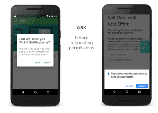
  • Pre-ask before requesting permission
    • Because you only have one chance from the user to give or deny push permissions, make sure the service you’re using will tell the user about this before asking

Final considerations

Push notifications is a new marketing channel, with great potential. They allow you to get personal with your customers, in a simple and non intrusive way. As with emailing, do not oversend. The fact that push doesn’t interrupt user activity is not a license to send them very often them.


from Blog – Smart Insights https://www.smartinsights.com/ecommerce/web-push-notifications/

via Tumblr http://euro3plast-fr.tumblr.com/post/169070406374
Thursday, 28 December 2017

7 ways to improve customer experience on mobile

Optimize your customer experience on mobile to avoid being left behind

Not long back, the secret of business success on the Internet seemed to be all about product and service quality. Whereas quality is an enabler of success, it’s not the big secret that makes e-businesses successful. The secret is – customer experience.

Econsultancy conducted a survey for Digital Market Trends, and the results made it obvious that most participating business executives considered customer experience as the most exciting opportunity of 2017.

Customer experience has supplanted content marketing and mobile marketing as the secret of e-business success for entrepreneurs.

User experience is important from an SEO perspective as well – websites where users don’t spend more than 10 seconds, because of messed up user experience designs, fail to sustain their rankings. What’s more, a Walker study predicts that customer experience will be more important than price as well as product by 2020.

The big question, then, is – how should businesses make use of this insight and grow more than their competitors? The answer – by focusing on customer experience on mobile. Though businesses need to deliver robust customer experiences across channels, mobile is where the leverage lies.

Mobile Customer Experience is Big

Numbers released by different research studies vary, but it’s clear, mobile searches are big.

The average user spends a bit more than 3 hours per day browsing on his smartphone. Applications of all kinds have become an integral part of the modern human’s day. And one thing common about the biggest brands that capture user’s attention and engage them on smartphones is that their mobile apps deliver tremendous user experience quality.

In fact, user experience is so powerful that companies can suffer from mass customer exodus purely because of faulty user experience design.

To make sure that your business fares better, here are 7 tips you can use to improve customer experiences on mobile.

1. Design For the Platform

For discussion’s sake, let’s only consider Android and iOS as the two operating systems you need to design your business application for. Both these OS work with unique conventions and standards.

  • The viable sizes and resolutions differ, as do the feel and visual appeal of UI components like data picker, checkboxes, and on/off switches.
  • Then, Android is made to support devices that have a dedicated back button.
  • Android offers tabs at the top of the page, and iOS does that at the top of the screen.

Now these are just a few of the OS level differences; the implications on the end user experience, however, are immense. To make sure your business apps don’t stumble over this pitfall, make sure your web developers and designers know that they make the app happily married to the operating system.

The fact of the matter is – your customers are highly engaged with their smartphones, and the OS design has a large contribution in there. Any business app that doesn’t sync well with the basic dynamics of use of the platform stands to fuel resentment and anger among users. Throw in the fact that apps lose 77% of their users within the first 3 days, and it’s clear how important it is to make the business app gel well with the platform it’s made for, to lay the foundation for great customer experiences.

2. Get the On-boarding Process Right

Invariably, mobile interactions between customers and brands are backed by intention, whether it’s opening your company website, downloading your brand app. This raises the stakes of your first impression on the customer. That’s where the importance of a well thought out on-boarding process makes its value known. Consider it the equivalent of the first date; impressions matter.

Whereas marketing wisdom has focused on making the most of the first mobile interaction to bring the customer as close as possible to the business goal (for instance, signing in for a newsletter), the customer experience approach differs. The idea here is to make the onboarding process as seamless, beneficial, and endearing as possible for the customer. Some guidelines to follow are:

  • Offer a super quick interface tour upfront to take the ambiguity and uncertainty out of the game.
  • Take out every unnecessary piece of information out of the first screen.
  • Include design elements that inspire positive emotions.
  • Make the onboarding process easy to skip, if the customer so desires.
  • If account creation is important, don’t ask for anything that can wait for later.
  • Make the on-boarding process as seamless as possible.

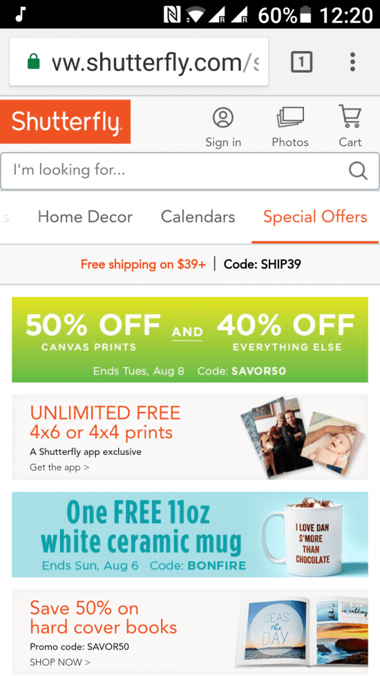
Shutterfly’s website gets most of these elements right.

shutterfly mobile user experience

3. Understand The Context of Mobile Interactions

The biggest pitfall that most businesses fall for, when it comes to maximizing customer experiences in mobile interactions, is the overdependence on design tools. Remember, the context comes first, always. Businesses that understand user profiles, interaction contexts and buyer personas are able to deliver memorable customer experiences.

Now is a good time to see if you have the answers to these critical questions:

  • Who are the target customers for whom the mobile interaction is being designed?
  • Are these customers experienced mobile users or just beginners?
  • What’s the need that triggers this mobile interaction for the customer?
  • What information is needed for them to complete their goal of using the mobile interaction mechanism?

Answers to these questions will help you design the customer journey on mobile websites and apps. This ‘journey’ should be the input for the wireframe of the mobile application, followed by the design.

4. Make the Experience Interactive

A sense of control enhances the quality of the experience a customer has interacting with your business’ mobile website or application. People fall in love with brands because of the way they interact with them, and the adjustments the brand is willing to make in its dealing based on attributes that are important for the customer. One way to translate this in mobile interactions is by making the customer experience more interactive.

Better interactions engage the user, captures his attention and gives you a strong thread to develop and take the customer to the business goal. Mobile app developers are increasingly aligning with the idea of developing web interfaces based on anticipated behaviors and thought out actions. Great customer experiences on mobile apps can be delivered by leveraging the principles of good communication for designing the user journey. For Instance, MailChimp’s mobile app uses images of high fives to signify completion of desirable actions from the user’s side.

5. Accessibility, Don’t Forget It

Nothing quite matches the frustration of accidentally tapping ‘Cancel’ when you actually want to tap ‘Save’. Make the buttons close enough on your business app, and you’ve got a might mess to clean up.

Make sure you understand key accessibility factors relevant for the target audience you wish to engage on mobile devices. Most people use their thumb to tap on mobile screen. Those who prefer two-handed usage of mobile phones use one or the other finger for tapping. So, understand the accessibility zones that these two styles create, their overlaps and make sure the action buttons and options are in these overlap areas.

Luke Wroblewski, Product Director with Google, suggests considering 4.5 inch screen held in vertical orientation is a good baseline to start mobile app or website customer experience designs.

6. Search – The Game Changer

The real estate you’re working with on mobile interactions is minimal as compared to a desktop or a laptop screen. Essentially, the content you have to offer remains the same, so navigation is a potential problem area that can hamper customer experiences on mobile devices. To avoid that, and to deliver fulfilling customer experiences around information search, make sure there is a search box or icon visible or accessible at all times during the mobile interaction. Of course, its positioning will depend on the guidelines of the platform for which the mobile application or website is being developed.

Two useful features that make search all the more powerful and beneficial for end users are:

  • Account for misspellings to make that users are able to find what they’re looking for
  • Include intelligent auto-fill and suggestions on alternative search queries

Filters also help a great deal, enabling customers to boil down to the content of their interest, step by step. Search and filter, together, bring a lot of control into the hands of the users, particularly when they’re faced with tremendous amounts of products, blog posts, articles, and options during their mobile interactions with brands.

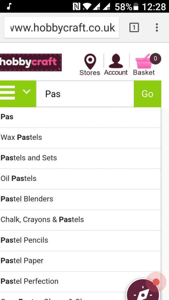
HobbyCraft’s website offers a very prominent search box with auto-fill as well as product suggestions, enhancing customers’ user experience.

Hobbycraft UX on mobile example

7. Regular Testing

It’s one thing asking customers what they want, another thing reading what experts think a user wants, and then, entirely another thing knowing what users want specifically while interacting with your brand on their mobile phones. Mobile user testing helps a great deal to fine tune your mobile websites and apps for maximizing customer experience quality. Is the user sign up form experience unusually high amounts of bounce rate? What percentage of customers use your most valuable and expensive-to-develop functionalities? Lessons learned from analytics and A/B testing prove invaluable in helping you identify aspects of customer experience that matter the most.

Final Words

As you read this, your competitors are upping their mobile customer experience game. It’s time you invested efforts and resources in improving customer experiences on mobile devices to achieve your business goals.


from Blog – Smart Insights https://www.smartinsights.com/user-experience/usability/7-ways-improve-customer-experience-mobile/

via Tumblr http://euro3plast-fr.tumblr.com/post/169032895929

Tuesday, 26 December 2017

The Top 10 essentials of a contemporary web design

Which of these design elements are you using to enhance your web experience and conversion?

If you’re launching a new site or refreshing an existing site it’s important to ensure your site looks contemporary and appealing. Since website design styles and technologies change so rapidly, can quickly appear dated.

A site that meets your business goals, communicates your key messages and provides a great experience is most important as explained in the Smart Insights guide to improving results from your website. But to design a successful web site, it is also essential to know what trends are emerging and what elements are important to consider. Surely, different web pages are created for different purposes, so they will not, probably, have much in common. However, there will be certain generally used elements that can be added to a webpage to make it more successful.

Here is a checklist of features to consider.

1.Sizeable and Striking Responsive Images

striking responsive images

The visual impact that a web page produces on its visitors is one of the key issues to think about when you are designing a web page, particularly the home page. So, you should choose images carefully in order to catch your visitors’ attention at once, because images create strong visual experience and encourage the reader to scroll further. Whether you insert illustrations of your products and services, or whether you want to present your team and your projects, images should be large and qualitative. In addition, web pages with responsive design will allow your images to adjust to various types of screens, so you can be sure that your website will look equally good and you will ensure the best experience for your visitors, no matter what device they are using.

2. Animation and Visual Effects

To add to the visual impression, various visual effects and animation are used. One of the most popular effects is Parallax that creates the feeling of a true immersion, provides an unforgettable experience and makes your visitors want to come back to your site. Moreover, animation effects can be used to present the content of the web page. For instance, Post Carousel not only gives your visitors an opportunity to enjoy browsing your products in a sliding carousel but also saves your precious space on the page

3. Sophisticated and Stunning Typography

Another element to reinforce the visual impact on your visitors is typography. First of all, fonts are used to direct your visitors’ attention to a certain text. Secondly, they are applied to emphasize the general design of your web page. Carefully chosen fonts will tie in with the style of your web page, thus making it look more appealing. A lot of contemporary web templates contain a large variety of Google-integrated fonts, so you can select the ones that will best fulfill your needs.

4. Presented Products or Featured Video

Videos as a part of a web page are becoming more and more popular. First of all, they are aimed at those people who prefer getting information while watching videos rather than reading. Secondly, it is possible to save the space on the web page in such a way, because sometimes it is easier to present products or services in a video than to describe them with the help of the text on the web page. Moreover, it is an effective way to tell people about your company in the way you wish them to remember. As an example, take a look at presents Template Monster

4. Smart and Speedy Search

When people visit a web page, they are usually looking for some information or goods. Even if your webpage is crafted thoroughly and includes a powerful menu for an easier navigation, an effective search box will facilitate the process of finding appropriate results. This element is particularly useful for those websites that include a huge variety of products or goods. When you add new content, the web page grows, so a search box will promote navigation and increase your visitors’ chances of finding both old and new information that they need.

6. Shopping Cart and Pricing Tables

As more and more people do their shopping online, efficient web stores should think about their customers’ comfort. A shopping cart is an indispensable element in such cases because they allow visitors to add the goods that they want to purchase to their online cart whenever they want. In addition, pricing tables, which give you a chance to present differences in features of your goods in a simple, but effective way, let your visitors compare prices for different goods, thus making the process of choosing a needed item faster.

7. Controlled Calendar and Appointment Manager

When your company deals with meetings, timetables and appointments, you cannot overestimate online calendars and appointment managers. An effective calendar on a website helps both your visitors and you to plan the time. An appointment manager will let your customers book a meeting with you without leaving your website. This manager will be enormously useful for numerous companies, such as fitness clubs, clinics, beauty salons, art schools, and many more.

8. ‘Meet the team’ page

If you want to promote your specialists and to present information about your company’s team, you will find an option 'Meet the Team’ exceptionally useful. It gives you a chance to clearly and logically structure the information about professionals working in your company and to impress your visitors with their achievements. In this case, your readers will develop trust to your team, as they will definitely know who they are working with. You can emphasize your workers’ achievements, and your team will not appear to be faceless to the visitors.

9. 'Call to Action’ Buttons

It is impossible to imagine a modern web page without such buttons that incite a person to do something. These buttons can be used to encourage visitors to follow a link to find out further information, to subscribe to your website’s channel and so on.

10. Stay in Touch: Contact Information and Social Media

To communicate with your visitors regularly and effectively, it is vital to present your contact information in an appropriate way. You can include your phone number, emails, address, and so on. Carefully designed contact information will promote communication. In addition, social media buttons will let your visitors follow you on various social network and share your information quickly, thus attracting new visitors to your website.

To sum up, different elements of contemporary web design are providing effective ways to save the space on the web page, to present the content to the best advantage, and to promote your communication with people.


from Blog – Smart Insights https://www.smartinsights.com/user-experience/website-design/top-10-necessary-popular-elements-contemporary-web-design/

via Tumblr http://euro3plast-fr.tumblr.com/post/168958089719

Monday, 25 December 2017

SEO + CRO = Increased conversions

How to increase conversions with an SEO audit

Focusing on SEO while neglecting your conversion rate is a great way to wind up with a website that ranks highly for keywords your audience doesn’t use or attract a bunch of users who aren’t really looking to buy what you’re selling. That’s why you have to think about choosing the right SEO tools for you and focusing on more than just the technical aspects of your audits.

That’s right: you can use your SEO audits to improve not just rankings, but your conversion rates as well.

Smart Insights have just launched their latest Quick-Win, SEO Technical Audit. Carrying out an audit is often about making small modifications to parts of your website. When viewed individually, these changes might seem like incremental improvements, but when combined, they can make a significant impact on your site’s performance in the organic search results.

How will your SEO audit also improve your conversion rate?

One of the best parts about SEO audits is that you’ll boost conversions without ever having to open your analytics or view your conversion funnels, making them powerful CRO tools. This is because improving elements of your user experience will boost both search optimization and conversion optimization.

Site Speed

Slow page speed is the number one way to turn both humans and search engines off from your website and business. In fact, more than half of users will leave your website if it takes more than three seconds to load. 80% of those users will never come back.

A good SEO audit tool will alert you if your page is too slow, and find the bottlenecks that are slowing it down.

A good audit SEO audit tool, like WooRank, will alert you if your page is too slow, and find the bottlenecks that are slowing it down.

Shaving valuable seconds off of your site’s latency can be a huge boost to your sales. Just ask Amazon.

Mobile Friendliness

Just like with page speed, mobile friendliness is an important SEO ranking factor. And your mobile SEO audit is a great way to find opportunities for some CRO.

But wait a minute, you might say, mobile conversion rates aren’t very good anyway.

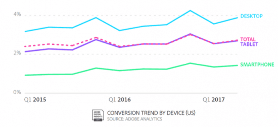
True (mobile conversion rate for ecommerce sites is less than half of desktop). But, it’s trending up year over year, and tablet conversions are just about even. So using your SEO audit to gauge your website’s mobile friendliness will also show you where to improve your mobile user experience.

SEO audit - mobile friendliness

Better user experience = better conversions.

As an added bonus, if you’ve got a brick-and-mortar storefront, improving the mobile version of your website can result in more store visits (and purchases).’

Broken Links

Links are how people move around the web, so a broken link is the same thing as having a bridge out on the way to your store. If no one can get there, no one can give you their money. Google also hates broken links because they’re bad for user experience and make crawling a website much, much harder.

An SEO audit will find your website’s broken links, allowing you to rebuild that bridge and get traffic flowing back to your store.

SEO audit - broken links

HTTPS Security

Getting an SSL certificate for your website will make it more trustworthy to customers, making them more likely to convert, and to Google, who gives a ranking bump to secure URLs.

Your SEO audit will identify if your website is secure. If you use one that takes a good look at your site, like Site Crawl, you’ll also be able to find sites that host non-HTTPS assets. This is very, very important for both CRO and SEO. Secure URLs with non-HTTPS images, scripts or videos will throw up a big scary red warning page in users’ browsers.

That’s a really good way to scare people off for good.

Custom 404 Pages

When someone links to a nonexistent page, it’s important that you have a soft landing spot for those visitors.

Seeing a 404 page is very frustrating for users, and dropping them on a blank default page leaves them with nothing to do but close the window. Add a custom page with some fun images, text and helpful links.

As I’m sure you’ve seen before, 404 pages are great opportunities to reinforce your company’s brand and maybe get some good press for it.

Adding internal links to a custom 404 page will still be considered a crawl error, but there will be a path for crawlers to follow to your homepage and beyond.


from Blog – Smart Insights https://www.smartinsights.com/search-engine-optimisation-seo/seo-strategy/seo-cro-increase-conversions/

via Tumblr http://euro3plast-fr.tumblr.com/post/168920501514

Friday, 22 December 2017

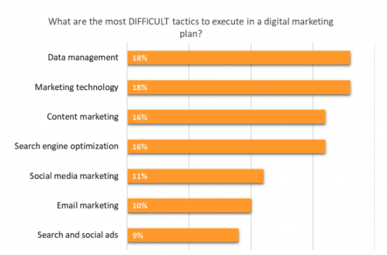
What are the most difficult marketing tactics to execute?

Chart of the day: Data management and marketing technology are the most difficult digital marketing tactics to execute, according to marketers

Data management and Martech require skills, resource and training. With GDPR heading with speed towards marketers, data management is increasingly important. Marketers also realize the potential of what it can bring to their marketing plans. Benefits of increased personalization and marketing automation are becoming clearer. We know a lack of digital skills is also a problem though.

Search and social ads were the least difficult digital marketing tactics, email and social media marketing are also much more mastered by marketers than Data management, marketing technology and content marketing. SEO is in the middle as expected, as it takes a lot of work, time and patience - but many are seeing the benefits of it and have SEO strategies which are working.


from Blog – Smart Insights https://www.smartinsights.com/digital-marketing-strategy/difficult-marketing-tactics-execute/

via Tumblr http://euro3plast-fr.tumblr.com/post/168823703279

Top traits of an effective marketing leader

4 behaviours that set top-performing marketers apart

Earlier this year the Harvard Business Review published a research paper that set out the top behaviors of the most successful CEOs. With many business leaders failing in their roles (from 2000 to 2013 25% of the Fortune 500 chief executives who left their firms were forced out) the authors conducted a study based on research conducted over 10 years with a database of 17,000 C-suite executives - including more than 2,000 CEOs - which covers all major industry sectors and a full range of company sizes.

It’s a fascinating article based on some really interesting research, revealing that one of the major reasons for CEO failure is that there’s a disconnect between what boards of directors think makes for an ideal CEO and what actually leads to high performance. After reading the article it occurred to me that many of the problems, causes and behaviours associated with the top-performing CEOs can also be applied to marketing. Whilst our role as marketers is far less all-encompassing, we’re nevertheless expected to lead in different ways in order to drive change and implement new ideas and ways of working.

Within this post, I would like to highlight each of the behaviours that set successful CEOs apart and illustrate with examples how they can also apply to marketing leaders more specifically.

The four behaviours

As the original HBR article explains, the behaviours identified sound deceptively simple, however, the key is to practice them with disciplined consistency, which happens to be a challenge for many leaders:

1. Deciding with speed and conviction

Effective leaders do not necessarily make great decisions all the time. Instead, they recognize that a wrong decision may be better than no decision at all and are therefore capable of making decisions earlier, faster and with conviction, often against a backdrop of incomplete information. This is something Amazon’s Jeff Bezos singled out in his 2016 letter to shareholders:

“If you wait for 90%, in most cases, you’re probably being slow.”

Marketing leaders are faced with many important decisions on an almost daily basis that have the potential to impact brand and business performance. Sometimes the data we receive as marketers is inconclusive and contradictory, offering no clear case to go one way or another. However whilst we may want to get to the ‘perfect’ answer, in reality, this is rarely possible and therefore judging the right amount of time to assess options and then move on to make a quick decision is crucial.

Consider framing decisions by asking yourself two questions:

  1. What’s the impact if I get it wrong?
  2. How much will it hold other things up if I don’t move on this?

2. Engage for impact

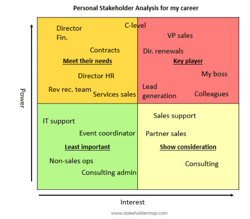
Once a clear course of action has been set it’s essential to get buy-in from key stakeholders. Strong alignment across the board is a top trait of effective leaders and involves an astute understanding of others’ needs and motivations and engaging others around a common goal.

Stakeholder analysis

Bringing others with you is particularly important for marketers, especially those in more technical roles and disciplines. SEO, for example, is a process typically managed by marketing and yet may impact different areas of a business, including public relations, ecommerce, sales and consumer affairs. However, everyone may not agree on your SEO plan, especially if it affects their department directly (e.g. an off-page strategy involving influencer outreach, something PR may typically manage).

An effective leader recognizes that whilst not all decisions will be popular, the key is to gain support by instilling confidence that their plan will lead to a successful outcome and benefit everyone overall. Conflict management and the ability to tackle difficult situations positively are therefore important skills to master.

3. Adaptiveness

The HBR study found that CEOs who excel at adapting are 6.7 times more likely to succeed and points to the aftermath of Brexit and the 2016 US presidential election as events that showed how certain leaders were able to adjust to a rapidly changing environment.

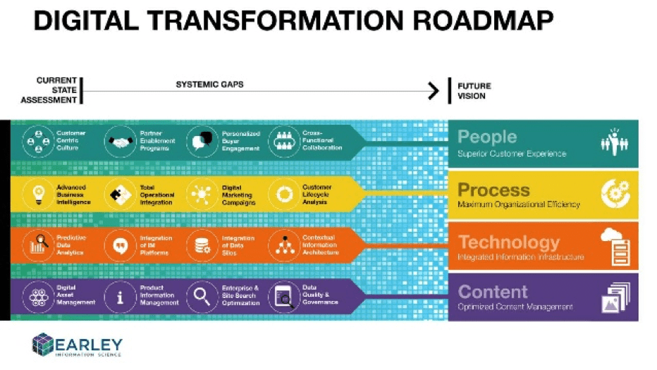
The evolution of digital transformation is impacting businesses in new and different ways and marketing is at the forefront of many of these changes. The advent of advanced AI (e.g.Google’s DeepMind), conversational interfaces (e.g. messaging bots and smart home devices) and the dominance of the ‘big four’ (Google, Facebook, Amazon, and Apple) are just a few examples of how business is evolving at a lightning pace. Nobody could have predicted 10, maybe even just 5 years ago, that by 2017 Google and Facebook would form a digital advertising duopoly.

Effective marketing leaders understand that to drive meaningful digital transformation at scale, businesses and brands must be open to change and a long-term perspective, all of which will enable marketers to optimise digital media activation, create first-class experiences and develop learning across the organization. Much of this will be dependent on each organization’s stage in the digital transformation journey:

Digital transformation roadmap

4. Reliability

The ability to deliver results reliably over time is a trait admired by both senior leaders and employees alike, with predictability and a steady hand being preferred to dazzling one-off successes.

Whilst reliability may not sound like the most exciting of characteristics, the ability to deliver consistently over time is a very difficult skill to master, which explains why this is cited as possibly the most powerful of the four essential CEO behaviours in the original HBR study.

A key practice here is about setting realistic expectations early in a role and spending time understanding the situational environment. Form a marketing perspective this will involve evaluating all elements of the marketing mix as well as the company or brand’s plans, budgets, and forecasts. Assessing the business landscape and gaining a clear idea of key stakeholder and customer expectations (see stakeholder analysis above) will enable you to align these with your own point of view of what’s realistic.

Strong organization skills is linked to reliability and good leaders establish effective business management systems, including:

  • Clear cadence of meetings with relevant stakeholders
  • Dashboard of meaningful metrics, updated regularly to reflect marketing performance
  • Strong team of individuals, each excelling in their specific areas of expertise

Conclusion

There is not ‘perfect mix’ of the four behaviours and every marketing leader will need to dial up certain traits depending on his or her specific situational context. For example, those working in a fast-moving, entrepreneurial environment such as a startup or small business, will need to excel at adapting proactively, whilst those working in more stable, corporate organizations may need a stronger emphasis on engaging for impact where stakeholder alignment is much more crucial to success.

Nevertheless, although other qualities including integrity, work ethic, compassion, and confidence are all very important, as the HRB study has shown good leaders who focus on these four essential behaviours are much more likely to be chosen for leadership roles and ultimately succeed in their position.


from Blog – Smart Insights https://www.smartinsights.com/digital-marketing-strategy/top-traits-effective-marketing-leader/

via Tumblr http://euro3plast-fr.tumblr.com/post/168822270719

Snapchat launch Lens Studio and Instagram tests recommended posts

Your social media weekly update

Welcome to our weekly summary of what’s happened in social media. We highlight the top stories to help you stay up to date with social media, here is what caught our attention this week.

Snapchat launches augmented reality developer platform Lens Studio

Snapchat have released the Lens Studio, a free desktop app for students, creatives, and developers to help bring their Snapchat creations to life. When developers have created a Lens they are given a special Snapcode that they can share anywhere, which anyone can scan to unlock the Lens. Snapchat reported:

With the launch of Lens Studio, we’re excited to make Lenses more accessible to creators, and experiences within Snapchat more personal and diverse. We’ve seen how much more fun Geofilters have become since first inviting the community to create their own three years ago — and can’t wait to see what you build with Lens Studio!

Facebook Introduces New Resources and Tools for the 360 Community

Facebook has launched a new centralized hub for all things 360 called the 360 Community Page. It offers educational resources and tools for all 360 creators such as tutorials on getting started with 360 cameras, 360 video editing workflows, and much more. Facebook announced:

Since launching 360 video on Facebook, we’ve seen more than 1 million 360 videos shared on our platform. As use of 360 has grown on Facebook, we’ve spent more time this year talking directly with the 360 community to learn about how we could make capturing and sharing 360 content even easier.

Instagram tests recommended posts from users you’re not following

Instagram is testing a new feature called Recommended to You, meaning Instagram will now let you follow hashtags in addition to individuals. The new Recommended Posts feature is within in a new section of your Instagram feed and highlights images from users that either your friends have liked or have been chosen for you by an algorithm.

Facebook opens AR platform to all developers

Facebook is allowing all developers to start building AR experiences for its Facebook Camera. That includes “World Effects” — Facebook’s copy of Snapchat’s World Lenses — that augment your environment with 3D objects rather than just your selfies. Facebook announced:

One of our goals with AR Studio is to put the power of augmented reality in the hands of all creators. Over the last few months, we’ve expanded the AR Studio toolset for even more creators to build and share AR experiences with the Facebook community.

Facebook crackdown on engagement bait

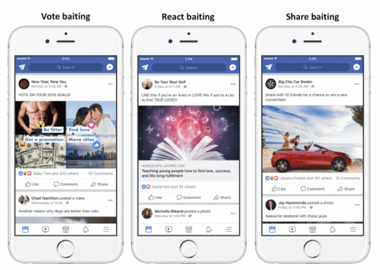
Facebook is cracking down on engagement bait. If you’re unsure what this means you may have seen phrases such as ‘Like this if’, 'Share if you’ and 'Tag a friend who’. Facebook will downrank these posts in users news feeds. As a result post such as these will be seen by fewer users and receive lower rates of engagement. In addition to downranking individual posts, Facebook says that pages that continually use engagement bait tactics will be penalized.

Facebook announced the following:

To help us foster more authentic engagement, teams at Facebook have reviewed and categorized hundreds of thousands of posts to inform a machine learning model that can detect different types of engagement bait. Posts that use this tactic will be shown less in News Feed.

Therefore business and brands that are using these tactics will need to reassess the quality of their content and find new more meaningful ways to engage with their audiences.

What do you think of Snapchats AR platform? Would you use Facebooks 360 community? Let us know what you think and connect with us on TwitterFacebookInstagram or LinkedIn. Don’t forget to join us next week for another weekly roundup.


from Blog – Smart Insights https://www.smartinsights.com/digital-marketing-strategy/105263/

via Tumblr http://euro3plast-fr.tumblr.com/post/168815620979

Ecommerce conversion rates

Our compilation comparing average conversion rates for retail sites and other industry sectors

As you will know, conversion rate is often used as a KPI to review the effectiveness of Ecommerce sites. Naturally all site managers and owners want to know, “how do our conversion rates compare?”

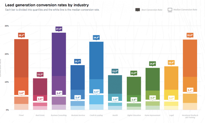
In this post I have compiled different free industry sources focusing on retail Ecommerce conversion, but towards the end of the post, a chart shows average conversion rates for a range of sectors including B2B conversion. At the end of this article we also feature an analysis of Unbounce landing page lead generation conversion by sector.

Before we get to the stats, one other caveat on analysis of conversion rates:

When benchmarking conversion rate, we think it’s important to explain to marketing managers that they should go beyond headline conversion rates to segment conversion by different types of visitor.

To see why, see Dan Barker’s excellent post explaining why conversion rate is a horrible measure to focus on…

December 2017 update - retail conversion rates by device

The Monetate Ecommerce Quarterly is a great source giving regularly updated benchmarks on conversion segmented by devices and media for large Ecommerce brands.

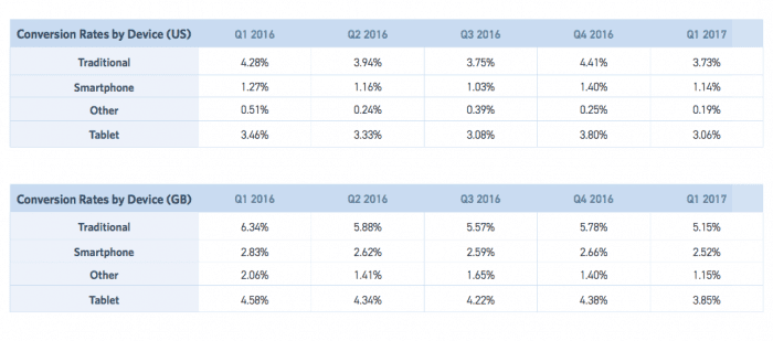
Their latest quarterly update shows conversion rates to add-to-basket or cart and below conversion to sale across the last 5 quarters:

Conversion Rates Q1 2016 Q2 2016 Q3 2016 Q4 2016 Q1 2017
Global 3.1% 2.81% 2.52% 2.94% 2.48%
US 3.04% 2.76% 2.48% 2.97% 2.46%
UK 4.5% 4.09% 3.88% 3.94% 3.57%
  Conversion Rates by Device Q1 2016 Q2 2016 Q3 2016 Q4 2016 Q1 2017
Global Desktop 4.23% 3.88% 3.66% 4.25% 3.63%
Smartphone 1.42% 1.31% 1.17% 1.49% 1.25%
Tablet 3.59% 3.44% 3.21% 3.79% 3.14%
US Desktop 4.28% 3.94% 3.75% 4.41% 3.73%
Smartphone 1.27% 1.16% 1.03% 1.40% 1.14%
Tablet 3.46% 3.33% 3.08% 3.80% 3.06
UK Desktop 6.34% 5.88% 5.57% 5.78% 5.15%
Smartphone 2.83% 2.62% 2.59% 2.66% 2.52%
Tablet 4.58% 4.34% 4.22% 4.38% 3.85%

With shoppers increasingly using smartphone and tablet to purchase, it’s vital for online retailers to know conversion benchmarks they should be achieving on smartphone device.  You can see that typically mcommerce conversion rates are around half of those on desktop. Improvements in mobile experiences over the past years haven’t impacted this figure, showing that smartphone is more popular as a device for browsing products while desktop is preferred more for transacting

December 2017 - Mobile conversion rates by traffic source or referrer

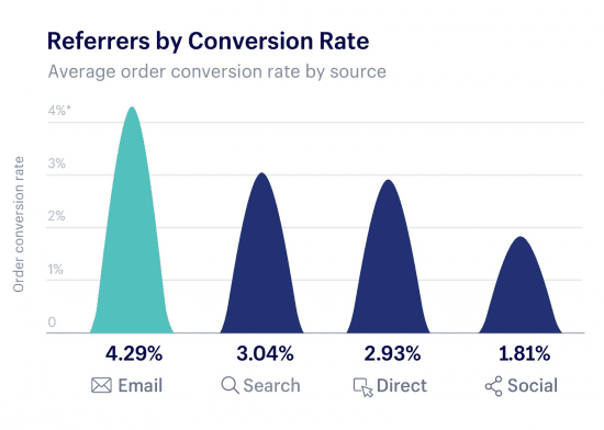
It’s rare to see conversion comparisons by traffic source. This data is from an analysis of over $1 billion in sales on the Shopify platform over Black Friday / Cyber Monday when 64% of sales were on smartphone, a 10% increase from the previous year.

You can see that email is the highest converting channel. We would expect this since email subscriber lists contain customers (and some prospects) that have higher conversion. Bear in mind that conversion rates for sales events can be significantly higher than during normal trading. Search visits are significantly higher converting than social since search has higher intent if someone is looking for a specific product or brand. Social media conversion has lower intent. Also since > 80% of social media browsing is on smartphone this will also decrease conversion since we have seen smartphone convesion is lower than desktop.

Mobile retail conversion rates

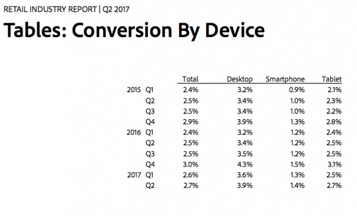
This report from the Adobe Digital Index retail report has a simple table comparing cart and visit (overall) conversion on smartphone vs tablet vs desktop. It shows that visit conversion is nearly 3 times higher on desktop vs smartphone.

Here are the tablulated figures:
  • Location: US Retail
  • Date: Published Autumn 2017 (2016 data)
  • Sample: Top 250 US retailers (so representative of common consumer behaviour)
  • Source: Adobe Retail Industry report

If you’re creating a business case for mobile optimised sites as explained in our Ecommerce mobile and desktop wireframes guide or mobile marketing strategy guide, this data is also valuable since it shows the variation in conversion rate by mobile devices type.  Tablet conversion rates are similar, but slightly lower than desktop conversion rates, suggesting people are increasingly comfortable with the experience of buying on tablets.

However, it’s a different story for Smartphones since these convert at one-third to one-quarter of the rate of traditional or tablet devices.

This suggests smartphones are more of browse or research platform rather than a buy platform since many of the large retailers featured in this survey will have mobile optimised sites. Smartphone experiences should be personalised to show this different form of usage. The lower conversion rates for mobile devices are also shown in these compilations of Android vs MacOS vs iOS operating systems, which gives the latest 4th quarter data released in early 2017.

Conversion rates by channel

Conversion rates for other sectors: telecoms and travel

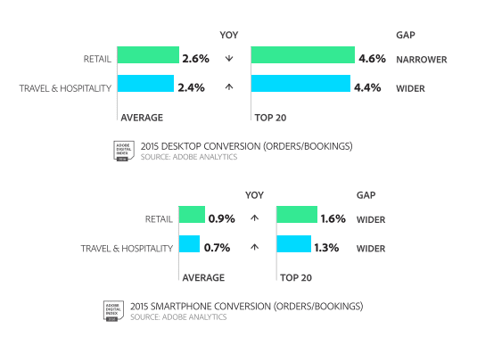
These are available in the Adobe Digital Index (ADI) - this data is available in the April 2016 published data for the whole of 2015.

2016 desktop vs mobile conversion stats

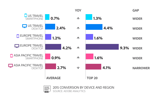
Conversion rates for US vs Europe vs Asia Pacific for the travel industry

The ADI report also compares conversion for EMEA countries against the US. UK and US conversion are significantly lower than other European countries perhaps because of less competition or Amazon being lower in these countries. Different rates of smartphone adoption will also affect this cross-platform average.

Travel sector conversion by device

Options for segmenting conversion rate

As Dan Barker suggests in his advice we mentioned at the start of this post, conversion rate gets more useful as you break it down by different types of visitors with different intent and a different relationship with the retailer. Different conversion rates and average order values can then be segmented for different audiences to understand and work to improve the quality of traffic or strength of propositions, for example:

  • First time, repeat visitor or registered customer conversion
  • Referring channel conversion, e.g. paid or natural search, social media, affiliates, display advertising
  • Search type, e.g. paid or natural, brand, generic or long-tail
  • Product category type - conversion rates are much higher for simple commodity products for example - flower purchase (double-digit percentage) compared with a higher cost product that will often be purchased in store (for example beds or furniture which will often be less than one percent).
  • Promotion type or seasonal sale - the IMRG data and Coremetrics data below shows that conversion rate can increase dramatically at these times.

Conversion rates for non Ecommerce sites including B2B conversion

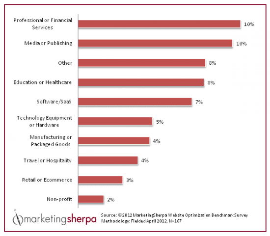
I’m also often asked about conversion rates in other sectors, particularly for business-to-business lead generation. While similar caveats about sub-category, type of visitor and strength of brand apply, this is a useful compilation from this older Marketing Sherpa of average conversion rates by industry sector.

Lead generation and landing page conversion rates by sector

However, this gives ‘self-reported’ conversion rates for lead generation, so  it was good to see this new Landing page lead generation conversion rate research from Unbounce giving lead conversion rates by industry particularly since it’s based on real-data of conversion rather than reported data which is more common for B2B and other sectors. Industries covered include business-to-business, Travel, Healthcare, Legal and Education sectors.

The chart shows wide variation within and between sectors with some businesses achieving lead generation conversion rates much higher than the media.  So, to compare against your rates it’s best to look at the media rates which vary between 2.8% and 6%.


from Blog – Smart Insights https://www.smartinsights.com/ecommerce/ecommerce-analytics/ecommerce-conversion-rates/

via Tumblr http://euro3plast-fr.tumblr.com/post/168815276004

Thursday, 21 December 2017

Forecast growth in percentage of online retail / Ecommerce sales

The potential for online retail growth on desktop and mobile devices

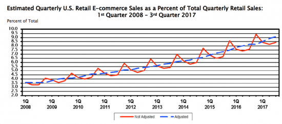
It’s interesting to look back at the growth of online sales and think forward to how much further they can grow at the expense of traditional channels. Overall percentage of Ecommerce retail sales are perhaps, surprisingly small at around 9% of sales in the US and 17% in the UK, but with sustained growth.

We will keep this research updated through 2018 as new research becomes available.

December 2017 update - new worldwide sales forecasts from eMarketer

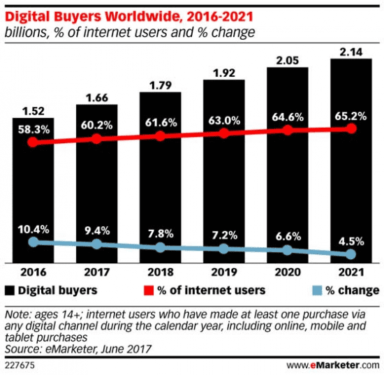
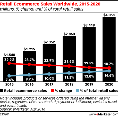
The latest ecommerce growth forecast from eMarketer is that ecommerce sales will increase 23.2% in 2017. It will account for one-tenth of total retail sales.

Total retail sales will reach $22.737 trillion by the end of this year, up 5.8% from 2016. This projection shows the growth in digital buyers. The declining percentage change shows that growth rates for ecommerce are declining, although they are still positive.

The latest eMarketer data on growth is only available to their paid subscribers. This 2016 summary of projected sales from eMarketer shows that retail ecommerce sales will increase to $4.058 trillion in 2020, making up 14.6% of total retail spending.

Retail E-commerce sales worldwide forecast

US E-commerce sales - December 2017 update

The US Government has been cataloguing the trend of percentage of ecommerce sales since the first edition of my book was published and you see there has been steady growth since. Although the overall percentage of sales is not as high as might be expected.

US E-commerce sales currently average out at 9.1 percent of total sales

December 2017 update - Retail reseearch centre

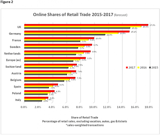
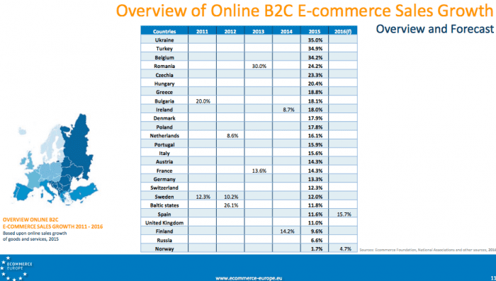
The Online Retailing: Britain, Europe, US and Canada 2017 research report from the Centre for Retail Research shows that the retail online retail sector is the main driver of growth in European and North American retailing, achieving in Europe growth rates of 18.2% (in 2015), 15.6% (2016), and expected increases in 2017 of 14.2% and 13.8% in 2018.

Here is their summary:

The countries with the highest online shares of their internal markets are: the UK (17.8% forecast for 2017); Germany (15.1% for 2017); and France (10.0% forecast for 2017). Other countries with high market shares are Sweden and The Netherlands. Germany has had the fastest-growing online sector for the last few years, but in 2017 its 16.4% forecast growth will be exceeded by Spain (+19.2%), Poland (17.2%) and Netherlands (17.0%).

September 2015 update - new UK Ecommerce predictions from Emarketer

These charts from eMarketer give a great visual summary of UK retail Ecommerce sales growth predictions. Although growth rates are declining, they will remain around 10% for next two years with total online retail sales reaching 19.3% by 2019 according to the prediction. Updated projections are only now available to eMarketer Pro subscribers.


uk ecommerce retail sales predictions 2014 to 2019

Another chart shows the need to focus on improving mobile ecommerce experiences. The report splits out mobile commerce sales which are already responsible for one third of online Ecommerce sales. The higher growth rates for mobile commerce are striking - currently around 38%.

mcommerce sales predictions 2014 2019

Remember that, as our compilation of desktop vs smartphone conversion rates shows, conversion rates are significantly lower on smartphones, so the mobile ecommerce experience should also signpost customer journeys that involve purchase via other online and offline channels. Even by 2019 the majority of retail sales will remain offline - the high street won’t disappear, just yet fortunately!

UK Ecommerce sales growth

In the UK, similar historical government data isn’t available, but the IMRG has catalogued the growth in E-retail sales for an even longer period with the chart below showing the importance of the Christmas period well. The government does report Ecommerce sales in its monthly retail sales reports which shows a higher figure than the US with…

UK online percentage of retail sales of 10.4% of total retail sales

Ecommerce sales percent

E-commerce sales growth in Europe

Previous estimates by Forrester are no longer updated, but a good alternative source is the E-commerceWiki (free registration) which is an initiative of the Ecommerce Foundation, a non-profit organization, initiated by worldwide national E-commerce associations.

This shows these growth rates in their most recent report with mature countries in the range 10 to 15% but 15% + in less mature countries.

European Online Sales Growth


from Blog – Smart Insights https://www.smartinsights.com/digital-marketing-strategy/online-retail-sales-growth/

via Tumblr http://euro3plast-fr.tumblr.com/post/168790971694